PlasmicLoader guide: components
Auto-generated API explorer
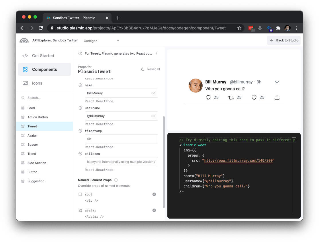
Each Plasmic project has an auto-generated developer docs portal with an interactive API explorer. You can access this by clicking the “Code” button in the Plasmic Studio toolbar.
Synopsis
import PlasmicLoader from '@plasmicapp/loader';export default function MyPage() {return (<div><PlasmicLoadercomponent="component-name"// Required if you have multiple projects with the same component name.projectId="some-project-id"// Any props or overrides you wish to pass to this component. See API below.componentProps={{onClick() {// ...},someComponentProp() {// ...}}}// Wrap this component in its own global variant providers.// Keep reading for a better way to achieve this across all components.providerProps={{Theme: 'dark'}}/></div>);}
Component API
PlasmicLoader renders purely presentational components that know how to render and style a component exactly as designed in Plasmic, and nothing else.
These components expose componentProps that allow you to control which variants to activate, which slots to fill with what content, and which elements to instrument with real data or event handlers.
There are four classes of props that you can pass to componentProps:
Variant props
Component variants are either simple standalone “toggle” variants, or they are organized into groups. For example, in a Button component, we may have a variant group role that includes primary and secondary variants, or a size group that includes small and large variants. Often the groups are single-choice — you only allow one variant per group to be active. But sometimes it makes sense for them to be multi-choice — for example, a Button component may have a variant group withIcons that has options prefix and suffix, both of which can be true at the same time.
Each toggle variant and each variant group is a prop.
- For toggle variants, you can pass in
trueif you want it activated. - For single-choice variant groups, you can pass in the name of the variant you want to activate, or
undefinedif none should be activated. - For multi-choice variant groups, you can pass in an array of variant names, or a object of variant names mapping to true or false.
Example:
// Passing in booleans to turn on `isLoading` variant.<PlasmicLoadercomponent="Button"componentProps={{isLoading: true}}/>// Passing in literals to turn on `role` and `withIcons` variants<PlasmicLoadercomponent="Button"componentProps={{role: "primary",withIcons: ["prefix", "suffix"]}}/>// Turning on variants conditionally<PlasmicLoadercomponent="Button"componentProps={{role: isPrimary() ? 'primary' : isSecondary() ? 'secondary' : undefined,withIcons:{prefix: hasPrefixIcon(),suffix: hasSuffixIcon()}}}/>
The variants prop
Instead of using the prop for each variant group, you can also use the variants prop, which allows you to specify all variants in one object:
<PlasmicLoadercomponent="Button"componentProps={{variants: {role: isPrimary() ? 'primary' : isSecondary() ? 'secondary' : undefined,withIcons: {prefix: hasPrefixIcon(),suffix: hasSuffixIcon()}}}}/>
Slot Props
Plasmic* components can also take in props that correspond to slots defined for the component. For example, a Button component might have slots that correspond to the button text (children ), the prefix icon, and the suffix icon:
<PlasmicLoadercomponent="Button"componentProps={{prefixIcon: ...,suffixIcon: ...}}>Hello!</PlasmicLoader>
Instead of using the prop for each slot, you can also use the args prop, which allows you to specify all such args in one object:
<PlasmicLoadercomponent="Button"componentProps={{args: {prefixIcon: ...,suffixIcon: ...,children: "Hello!"}}}/>
Override props
The component as designed in Plasmic creates a tree of elements that corresponds to the tree of layers you see in Plasmic. The override props allow you to customize this tree of elements exactly as you see fit to make your component come alive. You can modify the props used for each element, attach event handlers, override rendered content, wrap elements in other React components, and more. We want you to have total control in making the element tree exactly what you want.
You reference the element you want to override by its name; so if you want to override an element, you must first name that element in Plasmic.
For example, for the Button component, you might want to override its root element to attach click handlers:
<PlasmicLoadercomponent="Button"componentProps={{root: {props: {onClick: () => alert('I got clicked!')}}}}/>
Or maybe you want to render the Button as a link instead:
<PlasmicLoadercomponent="Button"componentProps={{root: {as: 'a',props: {href: 'https://plasmic.app'}}}}/>
The object you pass into the named node (“root”) above is the “Override object”. The Override object supports the following properties; you can mix and match them as needed:
props
Object of props to use for that element. Note that the element may be a normal HTML tag — in which case you can pass in HTML attributes — or a component — in which case you can pass in component props. For example,
{props: {title: user.name,onClick: () => ...,// etc.}}
as
The HTML tag to use to render this element. For example,{as: "a",props: {href: ...}}
Root override props
Any additional props you pass into a Plasmic* component are interpreted as an override for the root element. For example, instead of using the root prop as we did before, we can directly set the overrides on the Plasmic* component:
<PlasmicLoadercomponent="Button"// This is interpreted as a prop override for the `root` elementcomponentProps={{ onClick: () => alert('I got clicked!') }}/>
Component substitution
The componentProps API lets you customize any instance of a component, but when you are adding state or behavior (such as via hooks), you usually want this to be associated with the component itself (across all instances).
Besides attaching behavior, you may also want to altogether replace any component with an existing code component.
In these scenarios, you can tell Plasmic that wherever it encounters an instance of some Plasmic component, render instead a different React component of your choosing. This can be a wrapper that contains state/behavior, or it can be an entirely different component (don’t render the Plasmic design at all).
(Note: The following describes how to do this for components. You can also wrap pages by introducing an actual page at the desired route—see guide to using PlasmicLoader with pages.)
// In your plasmic config{substitutions: {components: [{ name: 'Header', path: 'src/components/Header.jsx' }],}}
Then from that React component, you can add arbitrary logic:
// src/components/Header.jsximport PlasmicLoader from '@plasmicapp/loader';import useUser from 'hooks/data/useUser';export default function Header(props) {// Do anything you want in this component!// For instance, add hooks or any other logic.const user = useUser();// Use PlasmicLoader to render the Header component from the Plasmic// project--this one *won't* be substituted recursively.return (<PlasmicLoadercomponent="Header"componentProps={{// Important! Spread the props to forward them to our plasmic header....props,}});// Or render something entirely different....// render <WebglPoweredHeader/>;}
(This is similar to the “wrapper components” from codegen.)
If you’re substituting existing code components, you can learn more about that case.
Have feedback on this page? Let us know on our forum.