Plasmic Animations
Plasmic provides numerous ways to add animations and visual effects to your project, ranging from simple transitions and hover effects to complex motion graphics and interactive animations.
There are many ways to implement them, including using code components, but the most common techniques for creating animations in Plasmic Studio are:
- Plasmic animations
- Lottie animations
- Rive animations
The animation feature provides a visual way to create keyframe animations for your elements in Plasmic Studio.
How to import default animation presets
Plasmic provides animation presets for common animations like fade in, fade out, slide in, and slide out.
You can import them into your project by opening the Assets → Animation Presets tab in the left sidebar and clicking the “Import preset animations” button.
How to create an animation in Plasmic
Creating a new animation is similar to creating style presets.
Think of an animations as multiple style presets spread over time that transition from one to another, with each preset being a keyframe.
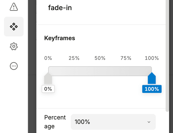
For example, let’s create a simple fade-in animation:
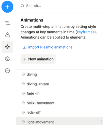
- Open the Assets → Animations tab in the left sidebar.
- Click the + New animation button.
- Enter a name for your animation.
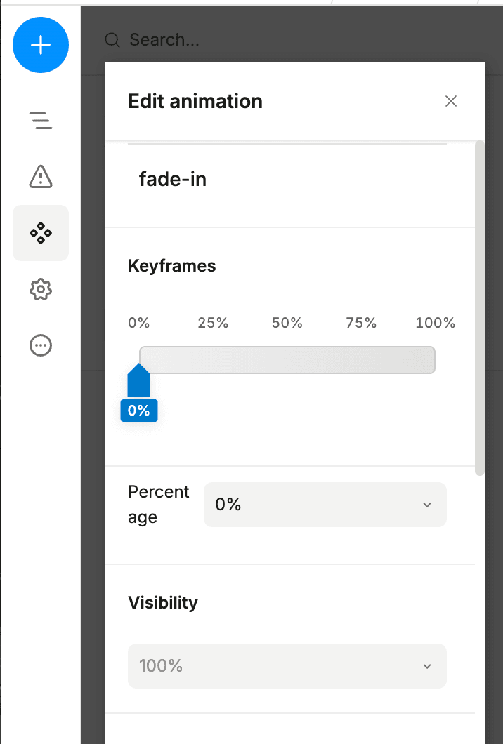
- At the top of the popup, below the name field, you’ll see a keyframe timeline selector. Initially, there will be only one keyframe at position
0%—this is the first frame of your animation. Set the Visibility to0%because we want the element to start hidden.
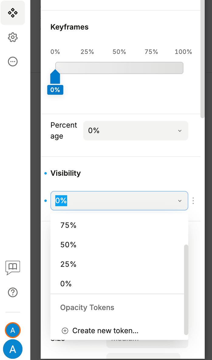
- Now, add a new keyframe at position
100%. Hover over the keyframe timeline and click on it. If you miss the needed value, drag it to the desired position or enter it manually in thePercentagefield.
-
Next, set the Visibility to
100%so the element becomes visible. -
Finally, add a Heading from the insert menu and select it. Then, navigate to the Design tab and apply your animation:
To see the animation in action, you need to open your project in the preview mode. Animation will not play in the editor mode.
Applying multiple animations to the same element
You can apply multiple animations to the same element, and they will play simultaneously or one after another if you set the delay property.
Keep in mind that animating the same property with multiple animations will create a conflict, and only the last applied animation will be visible.
For example, if you want to animate the transform property to rotate and move an element, you need to add two transforms in your keyframes instead of creating two separate animations—rotate and move.
Animations are rendered as native CSS keyframes, and keyframes can only animate one property at a time. The proper way to do this in code looks like this:
@keyframes move-and-rotate {from { transform: translateX(0) rotate(0deg); }to { transform: translateX(40px) rotate(20deg); }}
Limitations
- Instead of animating layout properties like
margin,position, orpadding, we recommend usingtransformto avoid performance issues. - Preview is not supported for animations in editor mode.
- Animations are only supported for basic elements, not custom component instances. Instead of applying animations to the component instance, apply them to the root element of the component, or wrap the instance in an element (e.g., a horizontal stack, vertical stack, etc.) and apply the animation to the wrapper element.
How to trigger animations
There are several ways to trigger animations in Plasmic:
- Using variants
- Using element variants
Both are similar, but the key difference is that variants require additional logic to enable them—via state, props, etc. With element variants, this isn’t needed because the variant is applied based on CSS selectors (such as :hover, :first-child, :disabled, etc.) rather than JavaScript events.
Examples
All of the examples below are available in this project, as well as an additional example for building more complex animations.
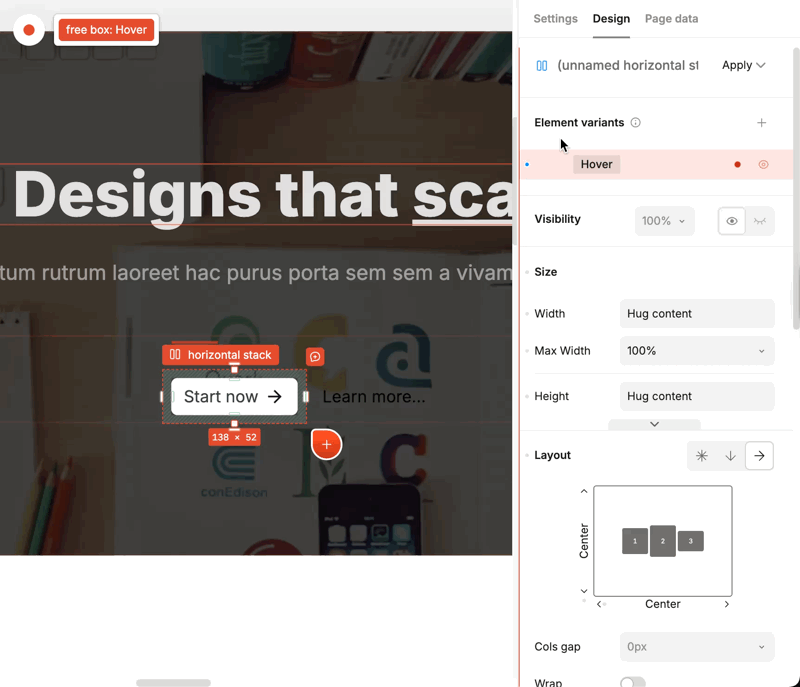
Example: trigger animation on hover using element variants
Let’s say we have a button component and we want to trigger an animation when it’s hovered.
- Create a new animation, as described in the How to create an animation in Plasmic section.
- Select the element you want to animate, navigate to the Design tab, and create a new element variant on Hover:
- Next, modify the element variant to apply the animation we want, and preview the result:
Example: using transitions to build a drawer menu
Sometimes you just want to animate a transition from one state to another. In this case, you can use the transition property of the component instead of creating an animation.
A good example is the open and closed states of a drawer menu. Let’s say we have the following menu component:
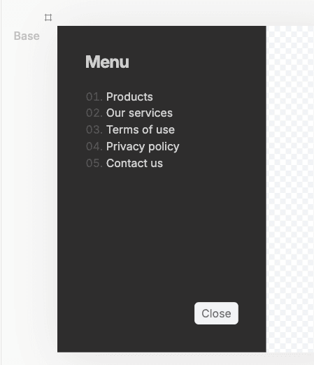
We want to animate the transition from closed to open when the button is clicked in the navigation and inside the drawer.
To achieve this, modify the transition to animate the transform property, which will change based on the current variant of the drawer:
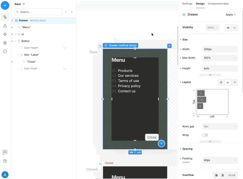
Then, connect the state variables within the Layout component that contains the drawer menu to wire up the buttons and switch between variants:
Example: trigger animation on state change using variants
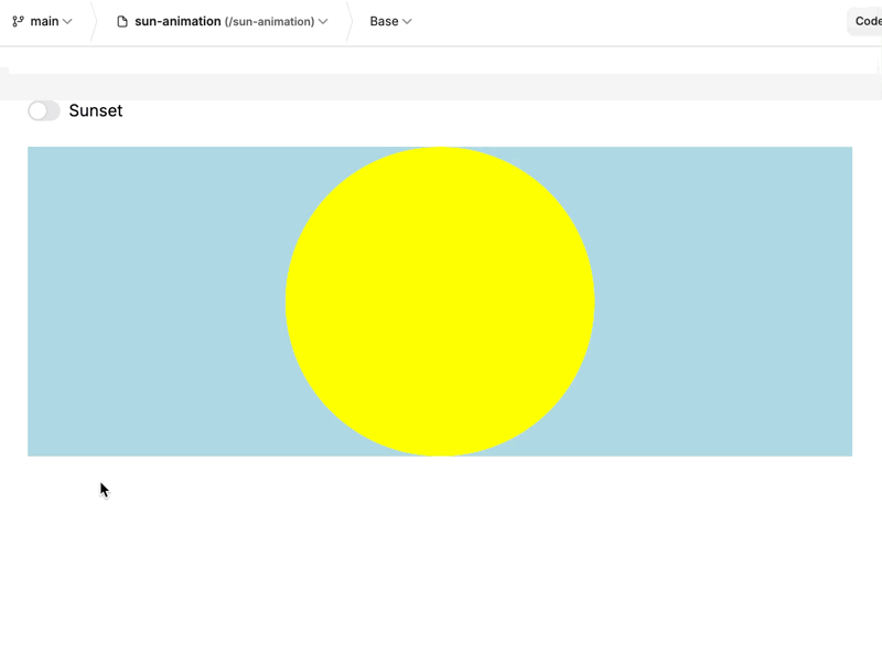
If you want to trigger an animation when a state changes, you can use variants to achieve this. We’ll use an example from MDN’s CSS animations documentation. The animation is a sunset/sunrise effect that triggers when a switch is toggled:
- Create a new component called
sun. For the root element, set the following properties:
- Height: 300px
- Background color: lightblue
- Overflow: hidden
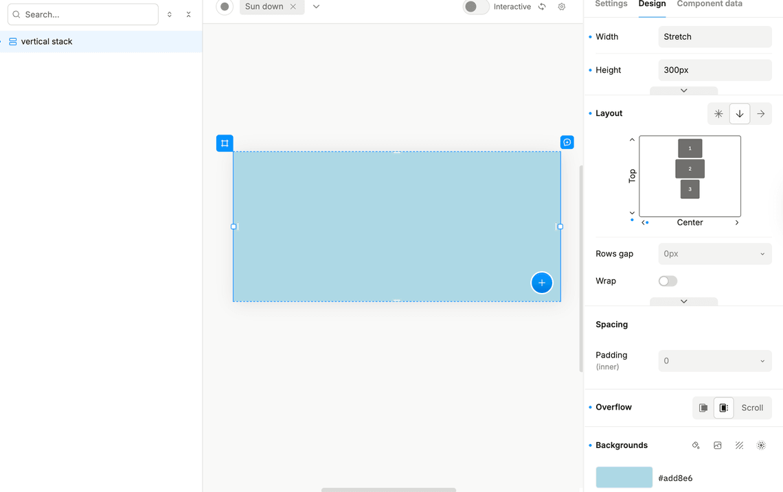
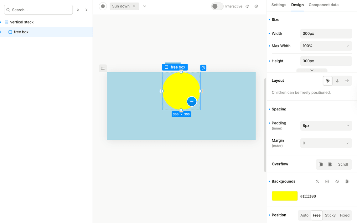
- Add a freebox and set the following properties:
- Width: 300px
- Height: 300px
- Background color: yellow
- Corner radius: 50%
- Position: free, and all sides set to
autoexcept for top which should be set to0
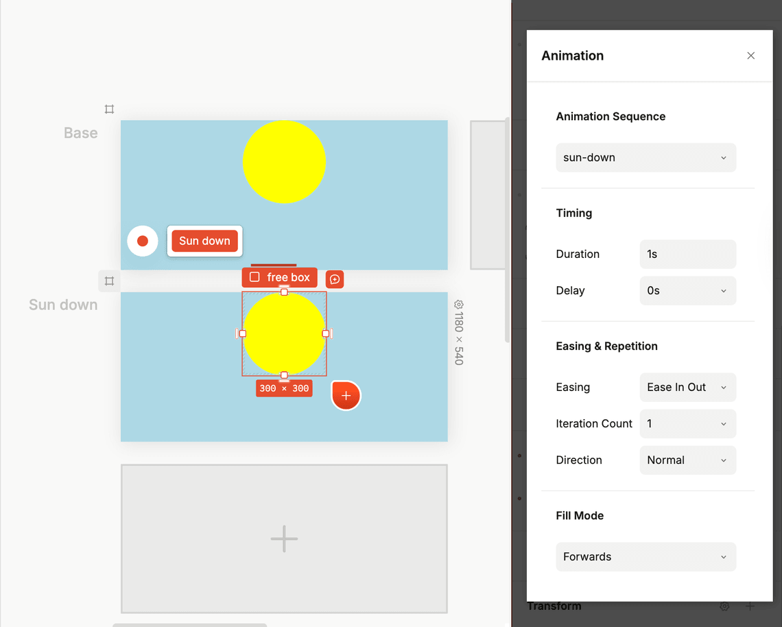
- Create two new animations called
sun-downandsun-upwith two keyframes at 0% and 100% for the Y positions:
- sun-down: 0%:
transform, move, Y: 0 - sun-down: 100%:
transform, move, Y: 100% - sun-up: 0%:
transform, move, Y: 100% - sun-up: 100%:
transform, move, Y: 0%
-
For the free box created in step 3, add a
sun-upanimation. -
Create a new variant called
Sun Downand add asun-downanimation to the free box with the following properties:
- Fill mode:
forwards- this keeps the sun in the down position after the animation ends
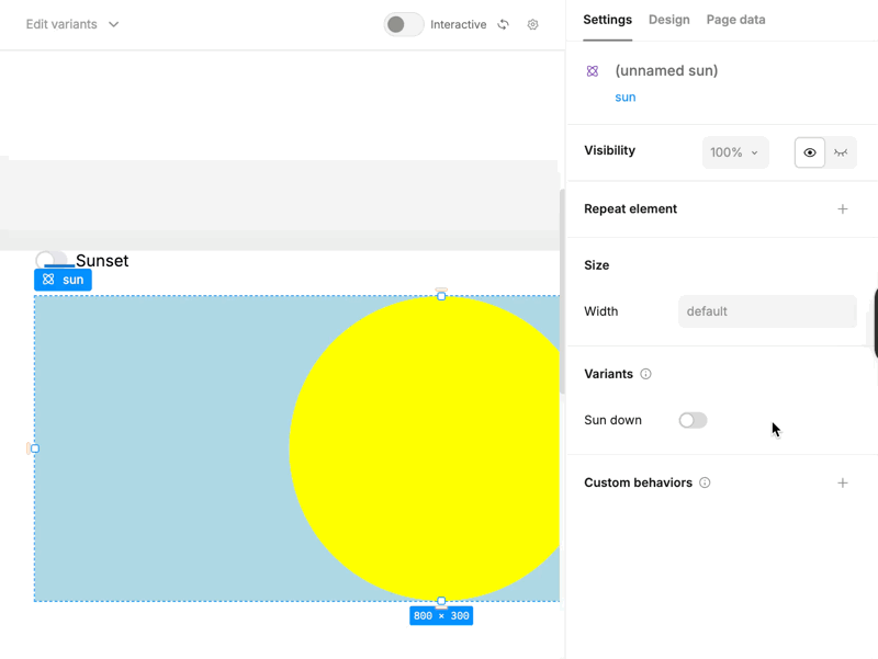
- Create a new empty page and add a
Switchcomponent from the insert menu with yoursuncomponent below it:
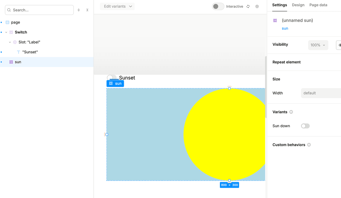
- Select your
suncomponent and add a dynamic value to the Sun up variant equal to the value of the switch’s state variable.
- Preview the project and click the button to see the sunset effect.