Variants
Variants allow you to create different visual states of a component and switch between them based on various circumstances. Variants can be thought of as “versions” of the same component that share the same structure but have different appearances or behaviors.
Types of variants
Plasmic offers several types of variants, each serving different purposes:
- Component variants (the main focus of this page) — Create different visual states of a component, such as size variations (Small, Medium, Large) or style variations (Primary, Secondary, Danger)
- Interaction variants — Define how components look during user interactions like hover, press, focus, or disabled states
- Global variants — Apply across your entire project for features like responsive design, dark mode, translations
- Element variants — Create interaction states for individual elements without creating separate components using CSS selectors like
:hover,:focus,:disabled, etc. - Registered variants — Define which states of code components should be available as variants in the Plasmic studio
Example: Button variants
Let’s create a Button component with the following variants:
- Color variants: Success, Error
- Accent variants: Shadow, Bevel
- Interaction variant: disabled: Enabled, Disabled
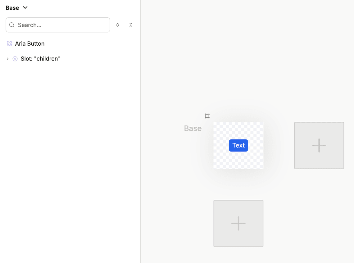
1. Create a component
First, let’s create the base version of our component. We can copy the contents of the Button component from the Customizable Components.
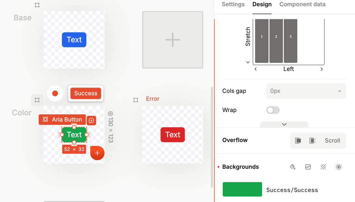
2. Create a “Color” variant group
Next, let’s create the color variants. Click on the canvas with the + sign below the main canvas and select Add single-select group of variants.
You will be immediately prompted to give the group a name. Let’s call it “Color”.
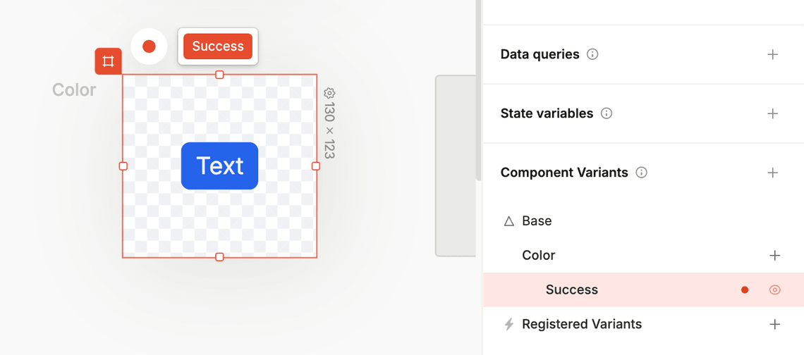
3. Activate a variant for editing
To make changes specific to a variant, you first need to activate that variant for editing:
- In editing mode: Select the variant from the toolbar on the top left
- In design mode: Use the dedicated artboard for each variant
- From the Component Data tab: Select the variant from the Component Data tab
The selected variant will be highlighted in red, indicating that you’re now recording changes for that variant.
4. Apply changes to the variant
When you make changes in the right panel while a variant is active:
- A red dot appears next to style settings that are defined in the current variant
- These red dots indicate overrides of the base variant
- Hover over the red dot to see the style that is overridden
- You can clear an override by right-clicking it and choosing Remove Style
To return to editing the base variant, simply select the base variant again in the Component Panel.
Let’s change the background color to green and red for the Success and Error variants respectively.
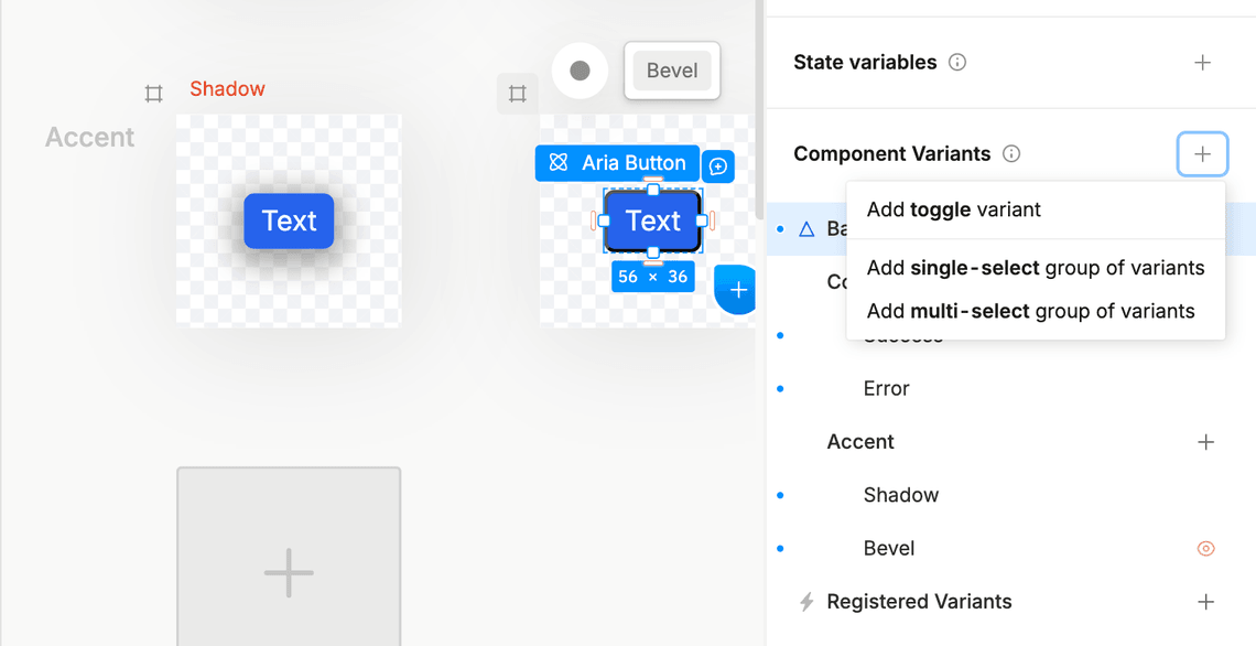
5. Create an “Accent” variant group
This time, let’s let’s create a variant group through the Component Data tab on the right side of the screen.
- Switch to the Component Data tab
- Find the variants section at the bottom
- Click the
+button near Component Variants to create a newMulti-select group of variants.
Then, using the same method as in step 3 and 4, select the variants and apply the changes:
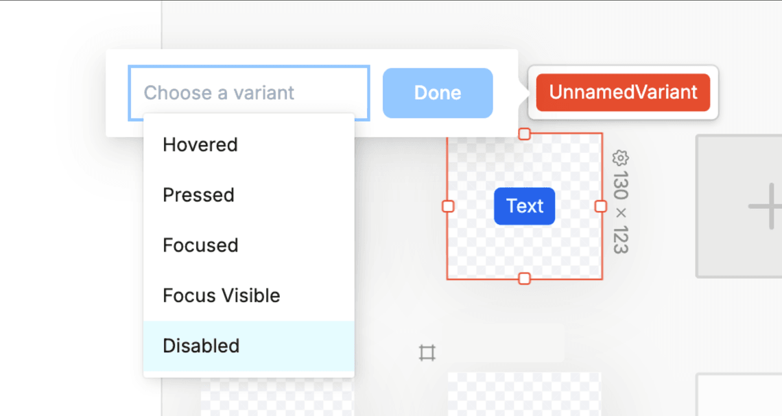
6. Create a “Disabled” interaction variant
Let’s create a “Disabled” interaction variant. To do that, click on the + button on the left to the main canvas, and select “Disabled” from the dropdown.
Then, using the same method as in step 3 and 4, select the variants and apply the changes to the visibility of the button, to make it 70% transparent.
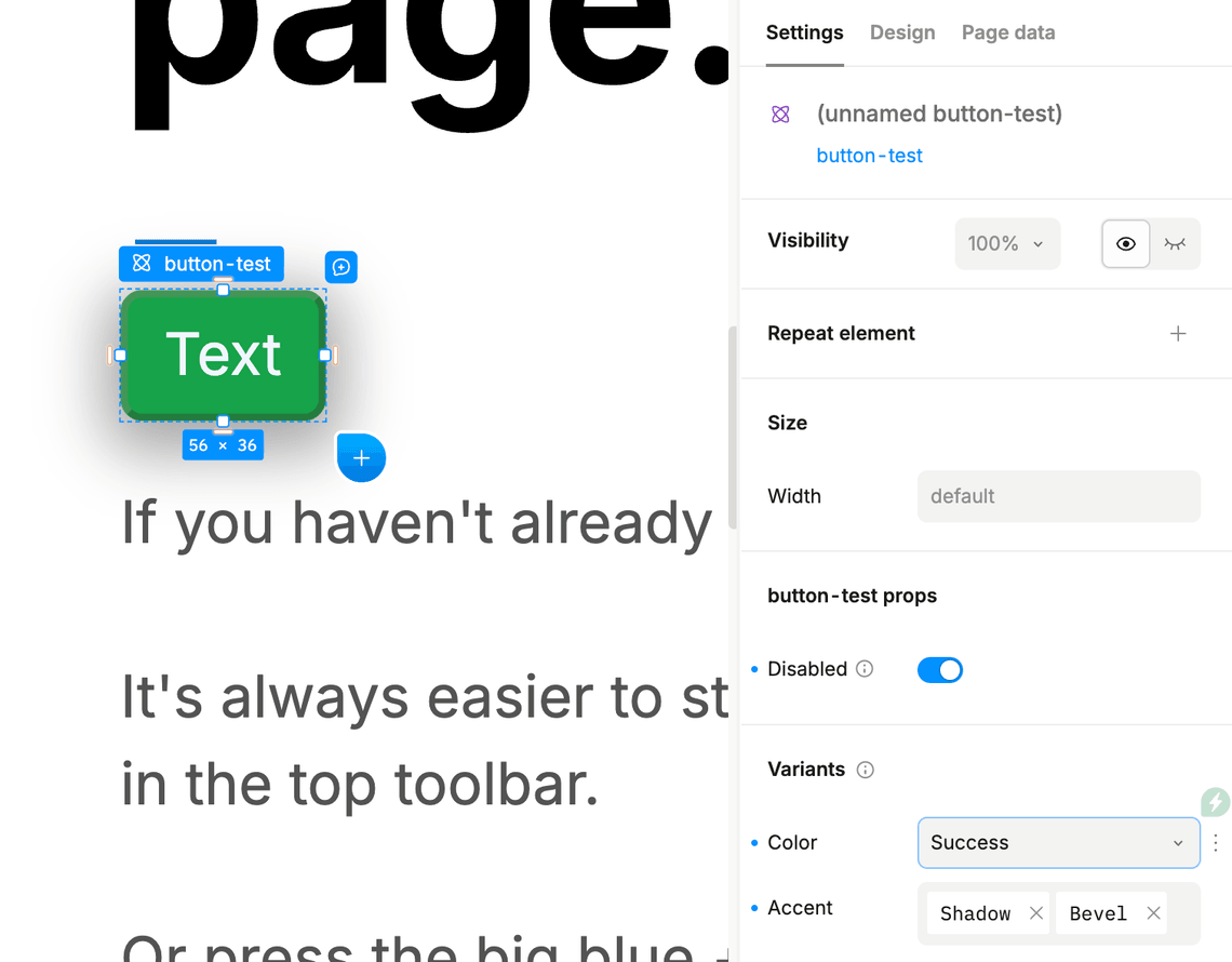
7. Allow external access to the disabled properties
To make sure we can select the disabled/enabled variant from the Settings tab on the element, we need to allow external access to the disabled properties. To do that, select the root element of the button, right-click the Disabled property in the Settings tab and select “Allow external access”.
8. Configure variants on the element
Each variant can be combined with others, so you could have a “Shadowed, Bevel, Success, Disabled” button that inherits styles from all four variant groups.
Insert your button into the page, and select the variants you created in the Settings tab on the element.
How variants work
Base variant and variant groups
Every component has a base variant that defines its default appearance. This is the foundation that all other variants build upon.
Variants can be organized and structured in different ways:
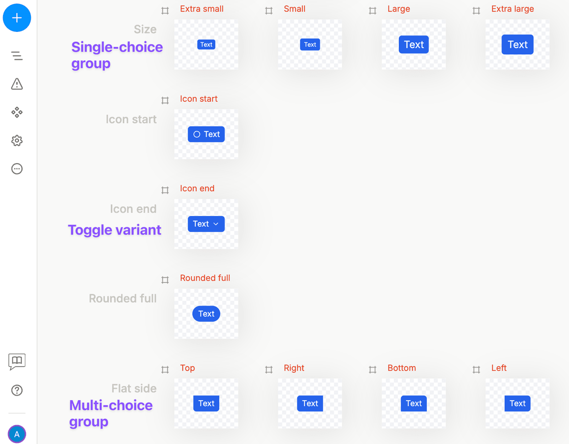
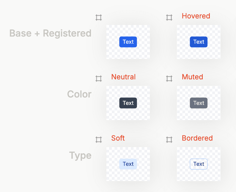
- Individual toggle variants: Single variants that can be turned on or off independently. For example, a “Disabled” variant that can be toggled on or off for any button.
- Single-choice variant groups: Groups where only one variant can be active at a time. A good example is a “Size” group containing Small, Medium, and Large variants - you can only have one size active.
- Multiple-choice variant groups: Groups where multiple variants can be active simultaneously. These organize related toggle variants together, like a “Accents” group containing “Bordered”, “Rounded”, and “Shadowed” variants that can all be active at once.
Variant inheritance and overrides
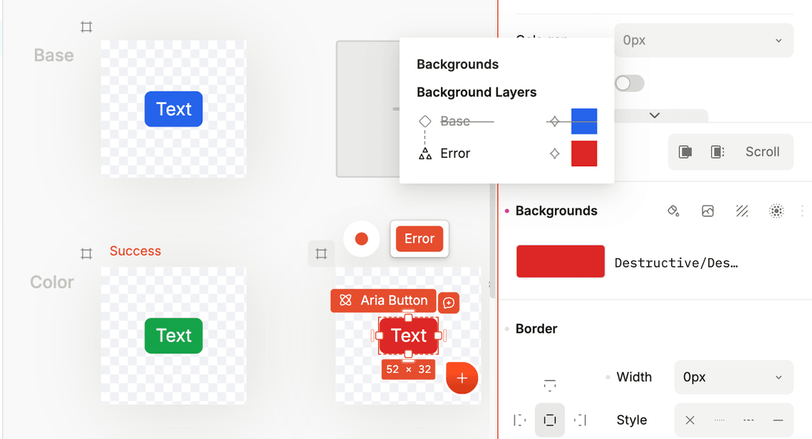
All variants inherit styles from the base variant by default. When you create a new variant, it starts with all the same styles as the base variant. You then override only the specific styles that should be different.
For example:
- Your Button’s base variant might have black text and a white background
- The “Large” variant inherits all base styles but overrides only the font size
- The “Primary” variant inherits all base styles but overrides the background color and text color
This inheritance system allows you to:
- Combine variants: A button can be both “Large” and “Primary” simultaneously
- Maintain consistency: Changes to the base variant automatically apply to all other variants
- Minimize redundancy: You only define the differences, not the entire style set

Best practices
- Put most styles in the base variant: This ensures consistency and makes maintenance easier
- Use variants only for necessary overrides: Only override styles that actually need to be different
- Make variants optional: Components can exist without any variants active, displaying only the base state
What variants can override
Variants can override several types of properties:
Design styles
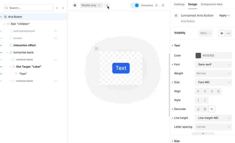
Most styles in the Design tab can be overridden by variants, including colors, typography, spacing, borders, and more.
Visibility
Control whether elements are shown or hidden in specific variants. For example, you can optionally show the icon in a button on the left, right, or both sides. Use the eye icon in the component tree to toggle visibility.
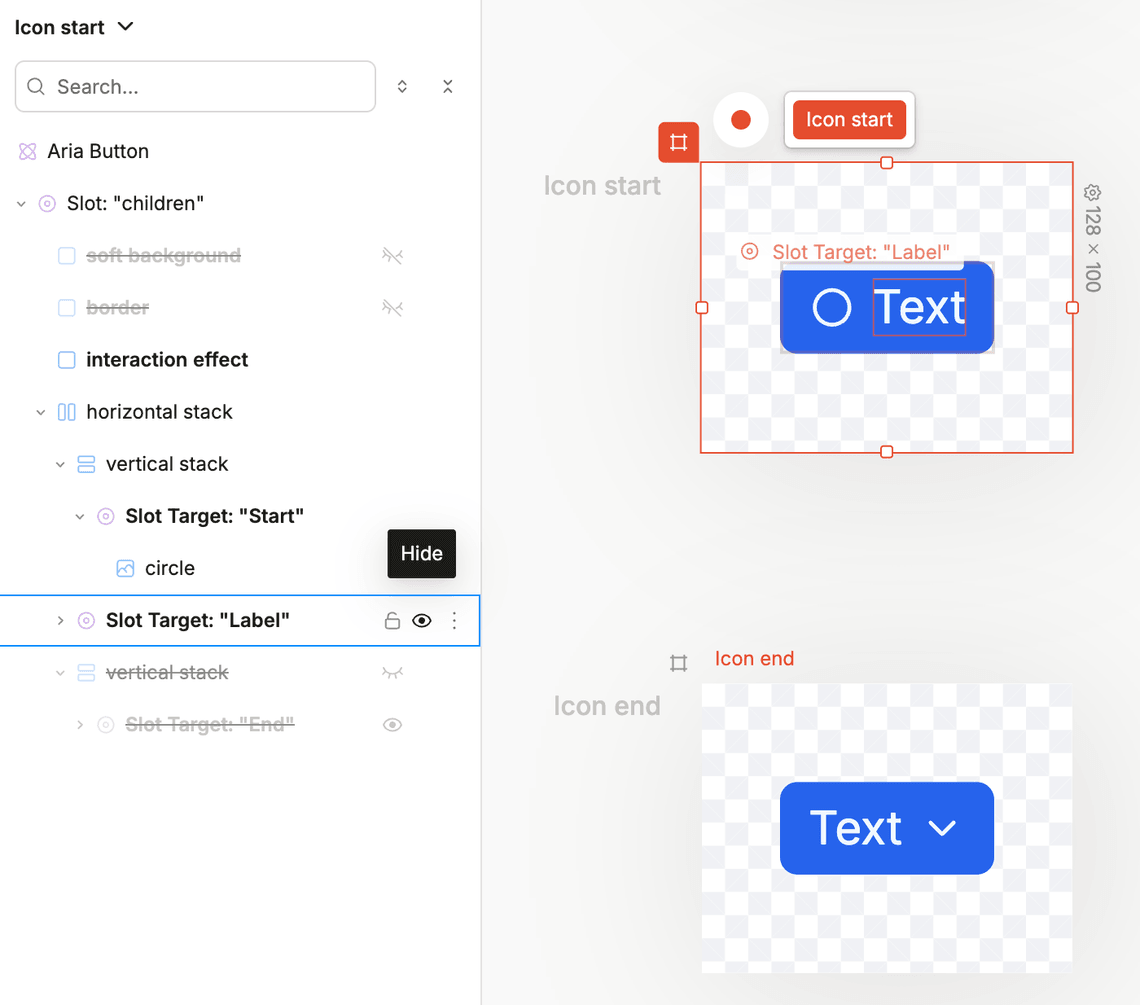
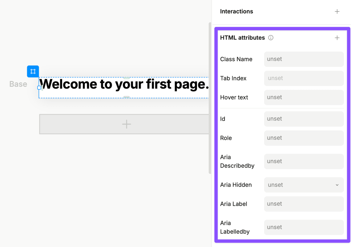
HTML attributes
Override element attributes like placeholder text for inputs, image sources, or any other HTML attribute.
Component props and nested variants
When your component contains other component instances, you can override their props and variants based on the parent component’s variant state.
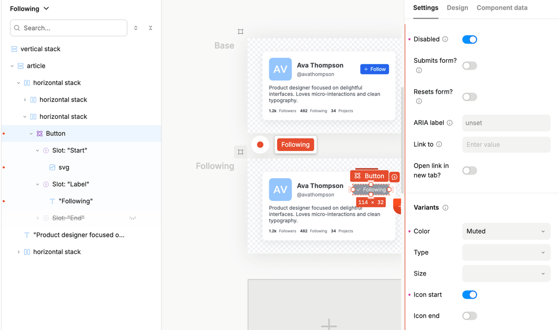
Example: A ProfileCard component with a follow/unfollow button:
- “Following” variant: Button has “Type = Disabled” variant active
- “Not following” variant: Button has “Type = Primary” variant active
Interaction variants
Interaction variants define how components look during user interactions. These are special variants that automatically activate based on user behavior.
Available interaction types
You can create interaction variants for these fundamental interaction types:
- Hovered: When the user hovers over the component
- Pressed: When the user clicks or taps the component
- Disabled: When the component is in a disabled state
- Focused: When the component receives keyboard focus
Combining interaction states
You can create interaction variants for combinations of states. For example:
- “Hovered and Not Disabled” — only applies hover styles when the component is enabled
- “Pressed and Focused” — applies styles when both conditions are true
How interaction variants work
- Nested structure: Interaction variants are always nested under regular variants
- Automatic activation: When you switch to Preview mode (Play button), these variants automatically activate based on user interactions
- Real-time feedback: You can see the interaction effects immediately as you interact with your design
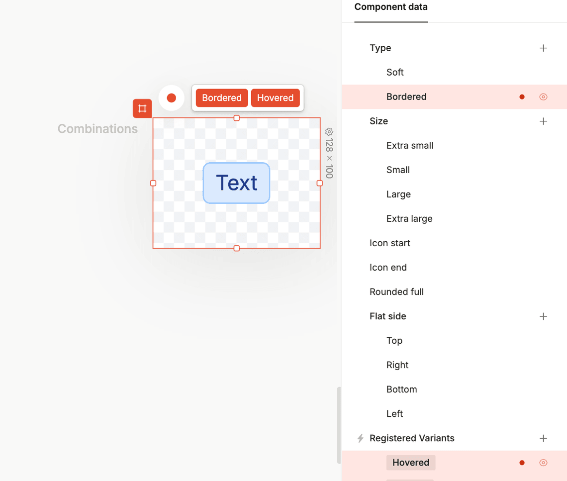
Targeting variant combinations
While individual variants can override specific styles, you can also create styles that apply only when multiple variants are active simultaneously.
Example: Button with combined variants
Let’s say you have a Button with these variants:
Base variant: Blue text on white background
- Hovered interaction variant: Brighter blue text on white background
- Bordered variant: Blue border, no background
The question: What should happen when hovering over a Bordered button?
The solution: Create a combination variant that targets “Hovered + Bordered” with white text on a bright blue background.
How to create combination variants
- Add a combination artboard: From the canvas, add a combination artboard to your component
- Specify the combination: Select which variants should be active together
- Design the combined state: Apply the styles that should appear when both variants are active
This allows you to create sophisticated interaction patterns where the visual result depends on multiple variant states working together.
Next steps
Now that you understand how variants work, you can:
- Create your first component with variants
- Experiment with interaction variants for better user experience
- Use variant combinations for complex interaction patterns
- Explore global variants for responsive design
- Explore element variants for interaction states on individual elements
- Explore registered variants for code components