Codegen Guide: Components
If you prefer an introduction to codegen in the context of a concrete example, check out the TodoMVC tutorial.
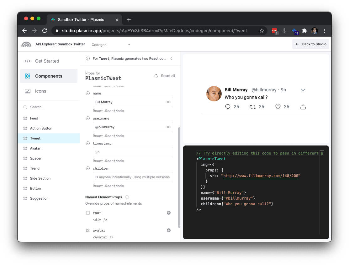
Auto-generated API explorer
Each Plasmic project has an auto-generated developer docs portal with an interactive API explorer. You can access this by clicking the “Code” button in the Plasmic Studio toolbar.
Global wrappers
Start your app with the following providers:
return (<PlasmicRootProvider><PlasmicGlobalContextsProvider><MyApp /></PlasmicGlobalContextsProvider></PlasmicRootProvider>);
What these do:
PlasmicRootProvider: If you have responsive variants that go beyond what can be represented using pure CSS/media queries and require React code, this enables these and makes them work with SSR.PlasmicGlobalContextsProvider: If you use code components that have global context providers—including components from the built-in component store—this includes all such providers.
Synopsis (kitchen sink example)
Note: understanding wrapper components vs Plasmic-owned components is key to the codegen scheme.
// Tweet.tsx// This is a skeleton starter React component generated by Plasmic.// This file is owned by you, feel free to edit as you see fit.import { PlasmicTweet, DefaultTweetProps } from './plasmic/PlasmicTweet';// Your component props start with props for variants and slots you defined// in Plasmic, but you can add more here, like event handlers that you can// attach to named nodes in your component.//// If you don't want to expose certain variants or slots as a prop, you can use// Omit to hide them://// interface TweetProps extends Omit<DefaultTweetProps, "hideProp1"|"hideProp2"> {// // etc.// }//// You can also stop extending from DefaultTweetProps altogether and have// total control over the props for your component.interface TweetProps extends DefaultTweetProps {tweet: TweetData;}export default function Tweet(props: DefaultTweetProps) {const { tweet, ...rest } = props;// You can use any logic, state, hooks, etc. that you want.const currentUser = useLoggedInUser();const appCtx = useContext(AppCtx);const menu = useTweetMenu(tweet);// Use PlasmicTweet to render this component as it was// designed in Plasmic, by activating the appropriate variants,// attaching the appropriate event handlers, etc. You// can also install whatever React hooks you need here to manage state or// fetch data.//// Props you can pass into PlasmicTweet are:// 1. Variants you want to activate,// 2. Contents for slots you want to fill,// 3. Overrides for any named node in the component to attach behavior and data,// 4. Props to set on the root node.//// By default, we just pipe all TweetProps here.return (<PlasmicTweet// We normally want to forward all the Plasmic-specific things.// This includes className and any variants others in the app might have passed in.{...rest}//// Activate simple toggle variants.isRetweet={tweet.isRetweet}isFollowingAuthor={appCtx.isFollowing(currentUser, tweet.author)}// Activate variants per variant group.threadMember={'middle'}//// Pass content (ReactNodes) into slots.name={tweet.author.name}username={tweet.author.username}children={tweet.body}//// Override props on any element.retweetButton={{onClick: () => props.onRetweet()}}avatarImg={{src: 'http://www.fillmurray.com/140/200'}}//// You can replace/wrap any element. Besides `wrap`, see also `as`, `render` and `wrapChildren`.menuButton={{wrap: (node) => <DropdownTrigger menu={menu}>{node}</DropdownTrigger>}}/>);}
Guiding principles
There are many ways to generate code from designs; here are the guiding principles that we follow to inform our decisions:
You can update components with new designs. Plasmic-generated code must have a persistent connection to design. Once you have attached behavior to Plasmic-generated components, it must still be possible to update the design of those components, and merge in newly-generated code without losing any of your existing work. This is in stark contrast to one-time code export tools, where once code is generated and edited for production, it can no longer be updated with new designs. With Plasmic, design and code are always connected through the lifetime of that component, not just in an initial code export.
You have total control over component props. The fact that a component is rendered by Plasmic should just be an implementation detail, and someone should be able to use a Plasmic-rendered component without even knowing what Plasmic is. In effect, this means giving you all the flexibility you need to curate the interface for your components exactly as you see fit. We do not want to litter your component props with all sorts of Plasmic-specific concerns or knowledge; instead, they should be encapsulated within your component.
You can instrument components to do anything. It must be possible for you to implement all the logic and behavior you want in a Plasmic-rendered component. You must be able to attach event handlers, fetch and render real production data, use React hooks and state, and everything else you expect to be able to do if you were writing the component from scratch. We make it easy to stay true to the design, but ultimately, you must have total control over what gets rendered to screen.
Codegen scheme
Plasmic generates Typescript or Javascript (TSX/JSX) code targeting React for the web.
Plasmic generates files that are used as blackbox libraries by your own React components to render things exactly as they were designed in Plasmic. There is a clear separation between files owned by Plasmic — in charge of presentation — and files owned by you — in charge of behavior. When the design of components are updated, the Plasmic-generated files are overwritten with the new designs.
By our guiding principles above, the codegen scheme allows you to:
- Update components with new designs by overwriting the Plasmic-owned files every time you run
plasmic sync. Since your edits are in developer-owned files, they will be safe, and will continue to work as long as the design didn’t introduce breaking changes. - Control component props by giving you total freedom in defining what props your component take, as long as you can map them to props that Plasmic-generated component understands.
- Instrument components to do anything by providing a rich API for attaching and overriding behavior to the Plasmic-generated elements, and letting you use React hooks as you usually would to manage state and fetch data.
Generated files
For each component in the Plasmic project, we generate two sets of files:
- Presentational Plasmic components (e.g.
plasmic/PlasmicButton.tsx) — The files in theplasmicdirectory are a blackbox that know how to render the component. Think of this as a utility library that you can call to render some UI. It is owned by Plasmic, and shouldn’t be edited by you. As you iterate on the design using Plasmic, these files will be updated when you runplasmic sync. - Wrapper components (e.g.
Button.tsx) — This source file is owned by you, and should be edited by you. Here, you define the actual React component used throughout your application, and make use of the presentationalPlasmic*component above to render the component, attaching the appropriate data bindings and event handlers as necessary. Plasmic generates an empty scaffolding for this file the first time this component is synced, and never touches it again.
When you first plasmic sync your Button component, you might see a Button.tsx file that looks something like this:
function Button(props: ButtonProps) {return <PlasmicButton {...props} />;}
Here, the Button component is the actual React component that you would use to create a button throughout the rest of your application. In turn, it calls the presentational PlasmicButton component to do the actual rendering.
We will talk about each of these in turn.
Working with Plasmic* components
The “presentational library” components like PlasmicButton expose a purely presentational component that knows how to render and style a component exactly as designed in Plasmic, and nothing else. These Plasmic* components expose props that allow you to control which variants to activate, which slots to fill with what content, and which elements to instrument with real data or event handlers. These files are owned by Plasmic and shouldn’t be edited by you; when the design for Button gets updated, plasmic sync will overwrite PlasmicButton.tsx to reflect the new designs.
Note that the Plasmic* components should typically only be used by its corresponding wrapper component (PlasmicButton should only be used by Button).
You should always use the wrapper component (Button) from the rest of your application. In this way, the Plasmic* is completely encapsulated by the wrapper component; no one else needs to know about PlasmicButton except for Button.
There are four classes of props that you can pass to the Plasmic* components:
Variant props
Component variants are either simple standalone “toggle” variants, or they are organized into groups. For example, in a Button component, we may have a variant group role that includes primary and secondary variants, or a size group that includes small and large variants. Often the groups are single-choice — you only allow one variant per group to be active. But sometimes it makes sense for them to be multi-choice — for example, a Button component may have a variant group withIcons that has options prefix and suffix, both of which can be true at the same time.
Each toggle variant and each variant group is a prop on the Plasmic* presentational component.
- For toggle variants, you can pass in
trueif you want it activated. - For single-choice variant groups, you can pass in the name of the variant you want to activate, or
undefinedif none should be activated. - For multi-choice variant groups, you can pass in an array of variant names, or a object of variant names mapping to true or false.
Example:
// Passing in booleans to turn on `isLoading` variant.<PlasmicButton isLoading />// Passing in literals to turn on `role` and `withIcons` variants<PlasmicButton role="primary" withIcons={["prefix", "suffix"]} />// Turning on variants conditionally<PlasmicButtonrole={isPrimary() ? "primary" : isSecondary() ? "secondary" : undefined}withIcons={{prefix: hasPrefixIcon(),suffix: hasSuffixIcon()}}/>
The variants prop
Instead of using the prop for each variant group, you can also use the variants prop, which allows you to specify all variants in one object:
<PlasmicButtonvariants={{role: isPrimary() ? 'primary' : isSecondary() ? 'secondary' : undefined,withIcons: {prefix: hasPrefixIcon(),suffix: hasSuffixIcon()}}}/>
Slot Props
Plasmic* components can also take in props that correspond to slots defined for the component. For example, a Button component might have slots that correspond to the button text (children ), the prefix icon, and the suffix icon:
<PlasmicButton prefixIcon={...} suffixIcon={...}>Hello!</PlasmicButton>
Instead of using the prop for each slot, you can also use the args prop, which allows you to specify all such args in one object:
<PlasmicButtonargs={{prefixIcon: ...,suffixIcon: ...,children: "Hello!"}}/>
Override props
The component as designed in Plasmic creates a tree of elements that corresponds to the tree of layers you see in Plasmic. The override props allow you to customize this tree of elements exactly as you see fit to make your component come alive. You can modify the props used for each element, attach event handlers, override rendered content, wrap elements in other React components, and more. We want you to have total control in making the element tree exactly what you want.
You reference the element you want to override by its name; so if you want to override an element, you must first name that element in Plasmic.
For example, for the Button component, you might want to override its root element to attach click handlers:
<PlasmicButtonroot={{props: {onClick: () => alert('I got clicked!')}}}/>
Or maybe you want to render the PlasmicButton as a link instead:
<PlasmicButtonroot={{as: 'a',props: {href: 'https://plasmic.app'}}}/>
The object you pass into the named node (“root”) above is the “Override object”. The Override object supports the following properties; you can mix and match them as needed:
props
Object of props to use for that element. Note that the element may be a normal HTML tag — in which case you can pass in HTML attributes — or a component — in which case you can pass in component props. For example,
{props: {title: user.name,onClick: () => ...,// etc.}}
as
The React.ElementType to use to render this element. This can be an HTML tag like “a” for links, or a React component. This element will then be rendered with that element type. For example,
{as: "a",props: {href: ...}}
render
A function that takes in the props and the component type that would be rendered, and returns a ReactNode. Doing this will completely replace this element with whatever is returned from the render function.
For example, this is a no-op (will behave as if no render function was specified):
{render: (props, Component) => <Component {...props} />;}
You can adjust the rendering in various ways:
{render: (props, Component) => (<Wrapper><Component className={props.className} value={value} onChange={handleChange} /></Wrapper>);}
You can swap in completely different content for this element:
{render: (props, Component) => <TotallyDifferentComponent />;}
You can also return null if you don’t want to render this element at all:
{render: (props, Component) => null;}
If you pass in a render function, then props and as are ignored.
wrap
A function that takes in the rendered ReactNode for this element, and returns another ReactNode. This is useful if you just want to wrap this element in something, like a context provider. For example,
{wrap: node => <Context.Provider value={…}>{node}</Context.Provider>}
wrapChildren
A function that takes in the rendered children for this element, and returns another ReactNode. This is useful if you want to append or prepend some custom content as a child of this element. For example, to implement an accessible “checkbox”, you may want to sneak in a visually hidden input element that’s not actually in the design:
{// insert a visually hidden checkbox input as the first childwrapChildren: (children) => (<><input className="visually-hidden" type="checkbox" />{children}</>);}
If you are planning to iterate over children, note that Plasmic-generated code will sometimes wrap elements in React.Fragments. Therefore, instead of using React.Children.map(), you should consider using something like react-keyed-flatten-children, which will flatten fragments for you.
Override object shorthands
Instead of passing in a full Override object as specified above, you can use one of these shorthands:
- An object of prop overrides — if you pass in an object without any of the known keys above (
props,as,render,wrap, andwrapChildren), we interpret that object as just a props override, equivalent to passing in{props: …}. - A
ReactNode— we interpret this as the children override, equivalent to{props: {children: …}}. - A function — we interpret this as the
renderoverride, equivalent to{render: …}.
Root override props
Any additional props you pass into a Plasmic* component are interpreted as an override for the root element. For example, instead of using the root prop as we did before, we can directly set the overrides on the Plasmic* component:
<PlasmicButton// This is interpreted as a prop override for the `root` elementonClick={() => alert('I got clicked!')}/>
Working with Wrapper Components
The wrapper components, like Button.tsx, define the actual React component that is used throughout the rest of your application. It can make use of the PlasmicButton component to render the button exactly as it was designed.
There are no restrictions to the edits you make to the wrapper component file. You can completely change the functional component to a class component. You can export exactly the props interface you want. You can add hooks, fetch data, add other components, etc. You can even make it not use the presentational library at all!
The main job of the wrapper component is to:
- Install any React hooks for state or data fetching.
- Pass in the appropriate variants to activate to the
Plasmic*component. - Pass in the appropriate content for each slot to the
Plasmic*component. - Attach event handlers and other overrides on the elements in the
Plasmic*component.
Your wrapper component file starts out like this:
import * as React from 'react';import { PlasmicButton, DefaultButtonProps } from './plasmic/PlasmicButton';interface ButtonProps extends DefaultButtonProps {}function Button(props: ButtonProps) {return <PlasmicButton {...props} />;}export default Button;
We’ll dive into the different pieces of this file here!
The wrapper component props
ButtonProps above extends from DefaultButtonProps. This set of default props are generated by Plasmic, and corresponds to the set of component props that Plasmic knows about.
Specifically, you will find a prop there for each:
- Component variant group
- Component slot
For the Button component we’ve been working with, you DefaultButtonProps might look something like…
interface DefaultButtonProps {// variantsrole?: 'primary' | 'secondary';withIcons?: 'prefix' | 'suffix' | ('prefix' | 'suffix')[] | { [v in 'prefix' | 'suffix']?: boolean };// slotschildren?: React.ReactNode;prefixIcon?: React.ReactNode;suffixIcon?: React.ReactNode;}
These are the ways in which one can customize a component instance within Plasmic, so we start out assuming that these are also the props that you’d want for your React component.
When the Button component calls <PlasmicButton {…props}/>, then, it is simply instantiating PlasmicButton with the activated variants and slot contents that the Button component itself was instantiated with.
If your component is also a purely presentational component with no additional logic or state, then this might be all you need!
But, sometimes that’s not the case. By our above guiding principles, we want you to be able to curate your component props exactly as you’d like.
Adding additional props
You should really be able to pass in onClick handler to the Button component, or it’d be pretty useless! We can do so by modifying the starting code like this:
interface ButtonProps extends DefaultButtonProps {onClick?: (e: React.MouseEvent) => void;}function Button(props: ButtonProps) {const { onClick, ...rest } = props;return (<PlasmicButton{...rest}root={{onClick: onClick}}/>);}
Note that because extra props sent to PlasmicButton are interested as root prop overrides, you can also simply do:
<PlasmicButton {...rest} onClick={onClick} />
Or, how about, sometimes, you want to be able to render Button as a link instead, if there’s an href passed in?
interface ButtonProps extends DefaultButtonProps {onClick?: (e: React.MouseEvent) => void;href?: string;}function Button(props: ButtonProps) {const { onClick, href, ...rest } = props;return (<PlasmicButton{...rest}root={{as: href ? "a" : undefined, // undefined uses default element typeprops: {onClick: onClickhref: href}}}/>);}
Or, maybe you want to just dump the kitchen sink of all possible “button” props?
// highlight-nextlineinterface ButtonProps extends DefaultButtonProps, React.ComponentProps<'button'> {href?: string;}function Button(props: ButtonProps) {const { role, withIcons, children, prefixIcon, suffixIcon, href, ...buttonProps } = props;return (<PlasmicButtonrole={role}withIcons={withIcons}children={children}prefixIcon={prefixIcon}suffixIcon={suffixIcon}root={{as: href ? 'a' : undefined, // undefined uses default element typeprops: {href: href,...buttonProps}}}/>);}
Important note: when you add new props to your wrapper component, it may no longer make sense to spread your wrapper component props to the Plasmic* component, since all extra props are interpreted as override props for your root element! For example,
interface TaskProps extends DefaultTaskProps {task: TaskItem;}function Task(props: TaskProps) {// Carefully pluck out `task` so that we don't pass it along as a prop to// `PlasmicTask`, which will interpret it as an override prop for the root// element, which may not make sense.const { task, ...rest } = props;return <PlasmicTask {...rest} children={task.name} />;}
Removing props from defaults
Sometimes, instead of adding props, you want to remove some of the default props. For example,
for the Button example above, you may not like having the withIcons variant group as a Button prop; shouldn’t we be able to just derive what withIcons variants to activate by whether a prefixIcon or a suffixIcon was given?
Indeed we can!
interface ButtonProps extends Omit<DefaultButtonProps, 'withIcons'> {onClick?: (e: React.MouseEvent) => void;}function Button(props: ButtonProps) {const { onClick, ...rest } = props;return (<PlasmicButton{...rest}withIcons={{prefix: !!props.prefixIcon,suffix: !!props.suffixIcon}}root={{onClick: onClick}}/>);}
Here, we use the built in Typescript utility type Omit to help us exclude the props from DefaultButtonProps that we don’t need, and instead derive it ourselves.
When you do this, though, you should set the corresponding withIcons prop’s “Export type” to “Internal” in Plasmic, by going to the Props tab of the component panel:
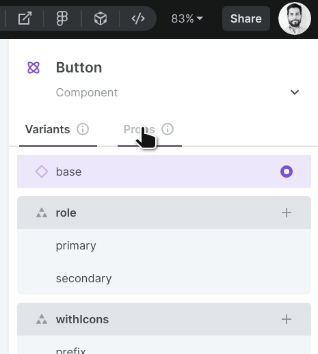
This tells Plasmic that this prop is only used “internally” within the wrapper component — that is, even though PlasmicButton knows about the withIcons prop, the wrapper Button component does not. This means whenever Plasmic generates code that uses Button, it will do so without specifying a withIcons prop.
Another scenario where this is useful is when you have variants that correspond to internal state:
function Task(props: TaskProps) {const [editing, setEditing] = useState(false);return (<PlasmicTask// Activating the `isEditing` variant is controlled by internal component// state, not by props.isEditing={editing ? 'isEditing' : undefined}/>);}
To recap, you should remove props from your default wrapper props when they can be derived from other props, state, or context. Again, this is about giving you the control you want to craft your component props in a way that makes sense for your application.
Working with slot props
If you are planning to iterate ReactNodes passed in as slot props, note that Plasmic-generated code will sometimes wrap elements in React.Fragments. Therefore, instead of using React.Children.map(), you should consider using something like react-keyed-flatten-children, which will flatten fragments for you.
Completely up to you
You can take this even further, and completely abandon the generated default props:
interface ButtonProps {// Whatever you want here, don't even extend from `DefaultButtonProps`!}
This is useful when your wrapper component props really wildly differs from the Plasmic* props. For example, maybe your component doesn’t need any props at all, and fetches data dynamically using a hook, or reads data from a context. Or, maybe your component props are in terms of your domain data model — a Tweet component for a to-do app might take in a data object as prop, instead of variants like “completed” or slots like “name”:
interface TaskProps {// domain data model objecttask: TaskItem;}function Task(props: TaskProps) {const { task } = props;const [isEditing, setEditing] = React.useState(false);return (<PlasmicTask// slotschildren={task.name}// variantsisCompleted={task.completed}isEditing={isEditing}// overrideseditButton={{onClick: () => setEditing(true)}}// etc./>);}
In these cases, it is up to you to map the wrapper component props to the Plasmic* props, to render the right thing.
Note a trade-off here, however. Plasmic does not know about or understand these domain data models; it only understands the variants and slots defined in Plasmic. In the Task example above, Plasmic doesn’t know about TaskItem, only variants like isCompleted or isEditing. That means when Plasmic generates code that uses your Task component, it will not know how to do it right. Instead, you will need to provide the appropriate overrides to feed your Task component the right props.
For example, consider a PinnedTask component renders the currently-pinned TaskItem:
function PinnedTask(props: PinnedTaskProps) {const pinnedTaskItem = usePinnedTaskItem();return (<PlasmicPinnedTask// override the props corresponding to the Task element so it gets the// domain data object it expectstask={{task: pinnedTaskItem}}/>);}
Using React hooks
Because your wrapper components are just like normal components, you can just use hooks for state management and data fetching as you normally would. You can already see many examples of using React hooks within wrapper components on this page.
Using class-based components
You can write your wrapper component however you’d like, including making it a class-based component instead!
class Button extends React.Component<ButtonProps> {render() {return <PlasmicButton ...>;}}
Rendering specific sections or elements
So far we’ve shown how, given a Plasmic component, you can render the entire component. However, you can also pluck out and render any named element in a component.
<PlasmicProfileCard.followButtononClick={...}children={`Follow ${user.name}`}/>
These are all accessible as components themselves that take all the same parameters (variants, slots, overrides) as in the original component, but filtered to just the elements within that sub-tree.
This is particularly helpful for one common scenario: wanting to turn a static list in a design into a dynamic list, which we’ll explain in the next section.
This may also be (more rarely) useful for complex, highly dynamic components where you just want to grab whatever pieces of the component suit you, and then compose them together.
const variants: PlasmicProfileCard__VariantArgs = {state: "following"};// all I want is the footer and the followButton...<div><div className="whatevers"><PlasmicProfileCard.footer variants={variants} /></div><div>// ima gonna just stick this right here<PlasmicProfileCard.followButton variants={variants} .../></div></div>
One thing to keep in mind is that you’ll likely want to render all these parts of the component in the same variant of that component. In the above example, we put the variants into a variable that we then consistently pass to all the parts.
Being able to pluck out pieces of the design and recompose them however you want is a powerful feature that gives you total flexibility in how to render your component. However, we generally encourage trying to stick to rendering the entire component when you can, since rendering the entire component keeps you closest to the original design even as the design evolves.
Repeated elements
Designs in Plasmic are static mocks, including any lists of elements. But in the real app you may want these to be dynamic sets of elements.
For instance, consider a Plasmic todo app, where you have a tasksContainer list that includes four instances of a Task component. Say these instances are elements named task1, task2, etc. This might look as follows:

Of course, this list is just a mock of four examples tasks, and in the real product you’ll want this to be a dynamic list ultimately coming from some data store or application state for the current user. Because these tasks are instances of a Task component, you can simply replace the contents of that taskContainer with your own instances:
<PlasmicTodoAppvariants={variants}tasksContainer={{children: tasks.map(task => (<Task task={task} />))}}})
But what if taskContainer didn’t simply contain Task instances, but rather just boxes or other non-component elements? Or what if it did contain Task instances, but the designer wants specific variants (or other props/styling) on them? Or what if we want to be robust to changes in the design—perhaps today it’s a collection of plain Task instances, but tomorrow it will be ?
A different approach is that you can render just the taskTemplate element (whatever it is—plain Task instance or not), using the approach described in the previous section for rendering any specific element:
// We want to render both the root element and the taskTemplate elements in the "nonempty" variant of the component, so lift the variants out into a reusable variable.const variants: PlasmicTodoApp__VariantsArgs = {state: "nonempty"};<PlasmicTodoAppvariants={variants}tasksContainer={{children: tasks.map(task =>// Use the renderer for taskTemplate, overriding what you need to.// We take care to render it in the right variants.<PlasmicTodoApp.taskTemplatevariants={variants}name={task.name}/>)}}})
This will ensure the tasks you dynamically render have all the other props and styling applied to taskTemplate by the designer in Plasmic Studio.
Substituting existing code components
You can render anything from your wrapper component.
You can even choose to not render the corresponding Plasmic* component at all, and instead render something else—such as an existing code component.
This is a very useful common case.
Learn more about code component substitution.