UI builder code tutorial: building TodoMVC
Before you start
In this tutorial we’re making TodoMVC, a standard introductory app. You can play with example implementations across various frameworks/languages at todomvc.com.
This is about using Plasmic as a UI builder—a more rare and advanced mode of using Plasmic! Users more commonly want to use Plasmic as an app builder.
This tutorial is focused on just the code, and is an intermediate-level intro to the Plasmic code integration. We’ll provide you with the finished design in Plasmic. From there you will be generating the presentational code and adding the required props, event handlers, etc. to bring the designs to life.
For an end-to-end tutorial that covers how to design new components and builds an even simpler app than TodoMVC, see the Minitwitter tutorial.
This tutorial covers the codegen mode of integrating Plasmic into a codebase, not PlasmicLoader. Codegen is recommended for when you’ll need a lot of interactivity or otherwise plan to hook up your components to a lot of code, which is the case for a task management app. For websites with mostly content and only light interactivity, we recommend using PlasmicLoader. Learn more about the distinction.
This tutorial also targets React with Typescript, but you can also follow along with Javascript (which Plasmic also supports).
As you learn Plasmic, please let us know all your questions and feedback! Reach us on our community forum.
Plasmic TodoMVC project
Before starting, make sure you have a Plasmic account already, and take a look at the TodoMVC Plasmic project to get a sense of what we’re making. You should make a copy of this project so you can play with it yourself.
We have a quick tour of the project that walks through the components that comprise the UI and (more importantly) how they’re modeled in terms of Plasmic’s core concepts. Please have a read to familiarize yourself with the structure of the project and these core concepts.
You can play with a completed codebase implementation on CodeSandbox:
All of the code for this completed implementation is also available on Github:
https://github.com/plasmicapp/todomvc
Setup
Follow these steps to set up your project.
First, create a brand-new React codebase named “todomvc”. In this tutorial we’ll be showing Typescript, but Plasmic also works with plain JS projects.
npx create-react-app todomvc --template typescriptcd todomvc/
Start the app, which should open up in your browser:
yarn start
The above gets you a brand-new generic React codebase. The next instructions are Plasmic-specific. You won’t need to remember these; if you just open up the Plasmic project and click on the Codegen toolbar button, you can also see the instructions laid out there:

Now, in a separate terminal, install the plasmic command-line tool:
yarn global add @plasmicapp/cli# ornpm install -g @plasmicapp/cli
Let’s create the initial ~/.plasmic.auth and plasmic.json file with:
# from todomvc folderplasmic init
If this is your first run, you’ll be prompted to create a Personal Access Token in Plasmic.
You’ll then be asked a short series of questions to help guide the initialization. Let’s go with the default choices. At the end, plasmic init will confirm with you to install our small runtime library.
$ plasmic init15:31:23:info Using existing Plasmic credentials at /Users/yang/.plasmic.auth? What directory should React component files (that you edit) be put into?> ./src/components? What directory should Plasmic-managed files be put into?(This is relative to ./src/components)> ./plasmic? What target language should Plasmic generate code in?(tsconfig.json detected, guessing Typescript)> ts15:31:25:info Successfully created plasmic.json.? @plasmicapp/react-web is a small runtime required by Plasmic-generated code.Do you want to add it now? Yes15:31:29:info yarn add -W @plasmicapp/react-webyarn add v1.22.4[1/4] 🔍 Resolving packages...[2/4] 🚚 Fetching packages...[3/4] 🔗 Linking dependencies...warning " > @testing-library/user-event@7.2.1" has unmet peer dependency "@testing-library/dom@>=5".[4/4] 🔨 Building fresh packages...success Saved lockfile.success Saved 2 new dependencies.info Direct dependencies└─ @plasmicapp/react-web@0.1.21info All dependencies├─ @plasmicapp/react-web@0.1.21└─ classnames@2.2.6✨ Done in 5.89s.15:31:35:info Successfully added @plasmicapp/react-web dependency.
If you decline to install the dependency, you can also always manually add it:
yarn add @plasmicapp/react-web# ornpm install @plasmicapp/react-web
Now ~/.plasmic.auth should have your credentials. Check out the plasmic.json (in the current directory) file if you’re curious what’s inside—it gives some clues as to what’s coming next!
Now you’re ready to generate some components. If you haven’t already, you should take a tour of the Plasmic project to understand how it’s structured.
First, make a copy of the TodoMVC Plasmic project - open it up and click “Make a copy” in the popup. This is so that you can later make edits to it and sync down the code.
In the newly created project, the URL has the following form, ending in the project’s unique ID:
https://studio.plasmic.app/projects/XXASAhKsCsKUuxeJL6gacV
Copy that project ID, and now sync down all components into /src/components/:
plasmic sync --projects {PROJECTID}
Next, edit your App.tsx to just render the generated TodoApp component and also fetch the fonts that the designs use:
import React from 'react';import TodoApp from './components/TodoApp';import ThemeContext from './components/plasmic/copy_of_todo_mvc/PlasmicGlobalVariant__Theme';function App() {return (<ThemeContext.Provider value={undefined}><TodoApp /></ThemeContext.Provider>);}export default App;
If you glance back in your browser window, you should now see TodoMVC on screen!
If you have a tall enough window, you may notice that the TodoApp component is not expanding to the full height of the screen. The TodoApp component is indeed set to stretch to the full height of its parent, but its parent is the unstyled #root div. Add the following to your app’s index.css to make our screen elements span at least the full viewport height:
#root {min-height: 100vh;display: flex;}#root > * {height: auto;}/*Explanation for the curious:We want the component's root div to cover at least the fullheight of the page, but *its* children may have height:100%.For that to work, we can't just set min-height; we have touse align-items: stretch, which height:100% will work with.This is generally the snippet you'll want to use if mountinga Plasmic component that's supposed to be the full page.*/
At this point we have just the static design in the browser, but next we’ll bring it to life.
Plasmic codegen primer
You should now have two new directories, src/components/ and src/components/plasmic/.
The plasmic subdirectory is owned and maintained by Plasmic; you should treat it as any library code, and not have to maintain or worry about its contents (similar to any component library you pull in via npm). It contains purely presentational components generated from the design, into which you can pass arbitrary props.
The other React tsx files placed directly in src/components/, on the other hand, are just empty scaffolding files for corresponding React components; you own these files, and should edit them as you see fit. See Codegen Guide for more details on the difference.
Hence, if you look at TodoApp.tsx, you’ll see that it’s just barebones scaffolding that simply renders the presentational library component:
// This is a skeleton starter React component generated by Plasmic.// This file is owned by you, feel free to edit as you see fit.import * as React from 'react';import { PlasmicTodoApp, DefaultTodoAppProps } from './plasmic/copy_of_todo_mvc/PlasmicTodoApp';import { HTMLElementRefOf } from '@plasmicapp/react-web';// Your component props start with props for variants and slots you defined// in Plasmic, but you can add more here, like event handlers that you can// attach to named nodes in your component.//// If you don't want to expose certain variants or slots as a prop, you can use// Omit to hide them://// interface TodoAppProps extends Omit<DefaultTodoAppProps, "hideProps1"|"hideProp2"> {// // etc.// }//// You can also stop extending from DefaultTodoAppProps altogether and have// total control over the props for your component.export interface TodoAppProps extends DefaultTodoAppProps {}function TodoApp_(props: TodoAppProps, ref: HTMLElementRefOf<'div'>) {// Use PlasmicTodoApp to render this component as it was// designed in Plasmic, by activating the appropriate variants,// attaching the appropriate event handlers, etc. You// can also install whatever React hooks you need here to manage state or// fetch data.//// Props you can pass into PlasmicTodoApp are:// 1. Variants you want to activate,// 2. Contents for slots you want to fill,// 3. Overrides for any named node in the component to attach behavior and data,// 4. Props to set on the root node.//// By default, we are just piping all TodoAppProps here, but feel free// to do whatever works for you.return <PlasmicTodoApp root={{ ref }} {...props} />;}const TodoApp = React.forwardRef(TodoApp_);export default TodoApp;
There’s a bunch of comments—removing this reveals the simple one-line functional component:
import * as React from 'react';import { PlasmicTodoApp, DefaultTodoAppProps } from './plasmic/copy_of_todo_mvc/PlasmicTodoApp';import { HTMLElementRefOf } from '@plasmicapp/react-web';export interface TodoAppProps extends DefaultTodoAppProps {}function TodoApp_(props: TodoAppProps, ref: HTMLElementRefOf<'div'>) {return <PlasmicTodoApp root={{ ref }} {...props} />;}const TodoApp = React.forwardRef(TodoApp_);export default TodoApp;
Before continuing, we’ll need to introduce some Plasmic concepts.
Variants
A Plasmic component can have variants defined on it. Each variant specifies a different way to render a component. For example, a Button component might have a “primary” variant that displays a blue background instead of the usual gray, or a “small” variant that uses smaller font size and tighter spacing.
Variants are organized into groups. In the Button component, we may have a group role that includes primary and secondary variants, or a size group that includes small and large variants. Often the groups are single-choice—you only allow one variant per group to be active (can’t have a button be both small and large).
Lastly, variant groups are optional, so the Button can have size be either small , large, or undefined (normal size). Above, the TodoApp has a state variant group with just a single option, empty, to show the app in the empty state.
Note: all names, including variant name strings, are transformed to camelCase, in order to adhere to Javascript convention.
Overrides
This is the place where you pass props to individual elements that make up the component. For instance, in TodoApp, the top title logo is a text element called app title. If you wanted to, you can rename the app and make the logo respond to a click like so:
function TodoApp(props: TodoAppProps, ref: HTMLElementRefOf<'div'>) {return (<PlasmicTodoApproot={{ ref }}{...props}appTitle={{children: 'toodoo',onClick: () => alert()}}/>);}
Beyond passing props, you can also wrap the element in something else or even completely replace or remove the element. We give the developer complete flexibility in changing what they need to in the rendered output.
Args
A Plasmic component renderer can also take in “Args”, which are ways designers have created to customize the component. Most often these are slots; think children prop in React. An example is a Card component, with slots for header and children; the Card component renders the styling and elements of the shell, but the actual header and body content of the Card is specified by whoever is instantiating the Card component.
In TodoMVC, notice how the Task component exposes a slot children. So passing in a children arg is how consumers pass it content to render as the text of the Task. If you wanted to, you could hard-code the text like so:
interface TaskProps extends DefaultTaskProps {}function Task(props: TaskProps, ref: HTMLElementRefOf<'div'>) {return (<PlasmicTask root={{ ref }} {...props}>My task name</PlasmicTask>);}
You could also achieve the same effect by directly using overrides to the replace children prop on the specific element in the Task where the slot is rendered, but specifying the component-designated slot is a bit higher-level and can shield you from, if for instance, the slot gets moved to a different element in the component.
Attaching real logic
Now let’s start wiring up our real event handlers and data to the elements in our components. To determine what are the elements in each component and what names to reference them by, you’ll want to keep the project open in Plasmic Studio.
Rendering a list
Let’s begin by powering the list with a real data model. We’ll use plain JS objects and built-in React context for state management.
Create src/model.ts to define your data model:
export interface Entry {id: number;done: boolean;descrip: string;}let nextId = 0;export function createEntry(descrip: string): Entry {return {id: ++nextId,done: false,descrip};}export type ShowFilter = 'all' | 'completed' | 'active';
Now update TodoApp to show a list of two Entries that live in React state. From looking inside of the Plasmic project, notice that the list is inside an element tasksContainer. So let’s override its children to reflect this list using the Task component by passing down Entries.
import * as React from 'react';import {PlasmicTodoApp,DefaultTodoAppProps} from './plasmic/todo_mvc/PlasmicTodoApp';import { useState } from 'react';import { createEntry, Entry } from '../model';import Task from './Task';import { HTMLElementRefOf } from '@plasmicapp/react-web';interface TodoAppProps extends DefaultTodoAppProps {}function TodoApp(props: TodoAppProps, ref: HTMLElementRefOf<'div'>) {const [entries, setEntries] = useState<Entry[]>([createEntry('Hello world'), createEntry('Goodbye world')]);return (<PlasmicTodoApproot={{ ref }}{...props}tasksContainer={{children: entries.map((entry) => <Task entry={entry} />)}}/>);}const TodoApp = React.forwardRef(TodoApp_);export default TodoApp;
You should see a type error because Task doesn’t yet take an entry prop. Let’s update Task to take this and actually reflect the Entry passed in:
...import * as React from "react";import { PlasmicTask, DefaultTaskProps } from "./plasmic/todo_mvc/PlasmicTask";import { Entry } from "../model";import { HTMLElementRefOf } from "@plasmicapp/react-web";interface TaskProps extends DefaultTaskProps {entry: Entry;}function Task({ entry, ...rest }: TaskProps, ref: HTMLElementRefOf<"div">) {return (<PlasmicTask root={{ ref }} {...rest} state={entry.done ? "checked" : undefined}>{entry.descrip}</PlasmicTask>);}export default Task;
Notice in particular that:
- We are specifying the
statevariant. - We are passing in the description to the
childrenslot. - We are making sure to exclude the
entryprop from therestof theDefaultTaskPropsthat get forwarded toPlasmicTask.
You should now see your two real (useState-managed) tasks in the browser!
Cleaning up the props interface
Notice we just added an Entry prop to Task, but we still have some unused props left over, state and children. These control how a Task is rendered, but they are not what you’d want in your real Task React component’s interface — instead, you’d rather have your Task React component take in an Entry data object, and derive the state and children values from that Entry object.
This is often the case in general — there are props exposed by the Plasmic presentational component that allow you to control how it’s rendered, but they don’t make sense as props in your actual React component. Instead, you want your actual React component to take in higher-level data objects, and derive the values you want to pass into these renderer knobs inside your React component, as you did above for the Task component.
So, let’s go ahead and just delete these knobs from TaskProps. Note that you always need to preserve and forward the className prop, since that’s how Plasmic communicates instance-specific layout styles to the component.
interface TaskProps {// className prop is required for positioning instances of// this ComponentclassName?: string;entry: Entry;}
Finishing the Task component
Finish the rest of the behavior of the Task component. It’s the most interactive component in the app.
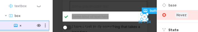
We’ll want to respond to clicks on the checkbox. However, there’s no way to override that element currently, since it’s an unnamed element, and we only generate override props for named elements—in Plasmic, you’ll see it’s just called box, which is the default name for the element.

Give it a name in Plasmic by double-clicking it in the left sidebar and entering checkbox. In general, you’ll want to name all the elements that you want to make interactive, add real data to, or otherwise override in any way.
While you’re here, let’s also rename the box displaying the name of the task to label, since we’ll want to handle double clicks to introduce edit mode.

And lastly, there’s a delete button on the right of the Task, but this is only visible in the Hover state, so switch to it first by bringing up the component panel and clicking the Hover variant. Call it deleteBtn.
Here’s a video showing us performing all these renames:
Re-run plasmic sync and edit the Task component.
Note: from here on out, we will skip showing import lines.
interface TaskProps {// className prop is required for positioning instances of// this ComponentclassName?: string;entry: Entry;onChange: (entry: Entry) => void;onDelete: () => void;}function Task({ entry, onChange, onDelete, ...rest }: TaskProps, ref: HTMLElementRefOf<'div'>) {const textInput = useRef<HTMLInputElement>(null);const [editing, setEditing] = useState(false);function finish() {onChange({...entry,descrip: textInput.current!.value});setEditing(false);}return (<PlasmicTaskroot={{ ref }}{...rest}state={editing ? 'editing' : entry.done ? 'checked' : undefined}checkbox={{onClick: () => onChange({ ...entry, done: !entry.done })}}label={{onDoubleClick: () => setEditing(true)}}deleteBtn={{onClick: () => {onDelete();}}}textInput={{ref: textInput,autoFocus: true,onBlur: () => {finish();},defaultValue: entry.descrip,onKeyDown: (e) => {if (e.key === 'Enter') {finish();}}}}>{entry.descrip}</PlasmicTask>);}
Now wire this up back in the top-level TodoApp:
function TodoApp(props: TodoAppProps, ref: HTMLElementRefOf<'div'>) {const [entries, setEntries] = useState<Entry[]>([createEntry('Hello world'), createEntry('Goodbye world')]);return (<PlasmicTodoApproot={{ ref }}{...props}tasksContainer={{children: entries.map((entry) => (<Taskentry={entry}onChange={(entry) => setEntries(entries.map((e) => (e.id === entry.id ? entry : e)))}onDelete={() => setEntries(entries.filter((e) => e.id !== entry.id))}/>))}}/>);}
You should now be able to rename, check off, and delete tasks.
Footer toggles
Let’s continue in this fashion and finish implementing the rest of the components, starting with the footer.
First, try out watch mode, which will actually live-stream changes made in Plasmic Studio as emitted code!
plasmic watch
We’ll want to support toggling between viewing all/completed/active tasks. Name the parts of Footer that need interactivity—the toggle buttons and the clear button:
allTogglecompletedToggleactiveToggleclearBtn
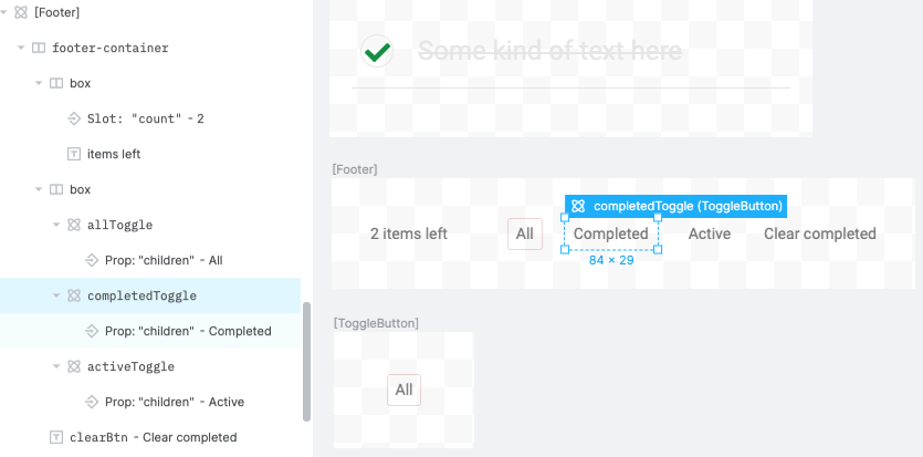
This video shows renaming all these elements:
Edit the ToggleButton component to support clicks and take a selected boolean.
interface ToggleButtonProps extends DefaultToggleButtonProps {onClick: () => void;selected: boolean;}function ToggleButton({onClick,selected,state,...restToggleButtonProps,ref: HTMLElementRefOf<'div'>) {return (<PlasmicToggleButtonroot={{ ref }}{...rest}state={selected ? 'selected' : undefined}onClick={onClick}/>);}
And implement the behavior in Footer:
interface FooterProps extends DefaultFooterProps {showFilter: ShowFilter;setShowFilter: (showFilter: ShowFilter) => void;onClear: () => void;}function Footer(props: FooterProps, ref: HTMLElementRefOf<'div'>) {const { showFilter, setShowFilter, onClear, ...rest } = props;return (<PlasmicFooterroot={{ ref }}{...rest}allToggle={{selected: showFilter === 'all',onClick: () => {setShowFilter('all');}}}completedToggle={{selected: showFilter === 'completed',onClick: () => {setShowFilter('completed');}}}activeToggle={{selected: showFilter === 'active',onClick: () => {setShowFilter('active');}}}clearBtn={{onClick: onClear}}/>);}
Finally, wire things up in the top-level TodoApp:
function TodoApp(props: TodoAppProps, ref: HTMLElementRefOf<'div'>) {const [entries, setEntries] = useState<Entry[]>([createEntry('Hello world'), createEntry('Goodbye world')]);const [showFilter, setShowFilter] = useState<ShowFilter>('all');const shownEntries = entries.filter((e) =>showFilter === 'active' ? !e.done : showFilter === 'completed' ? e.done : true);return (<PlasmicTodoApproot={{ ref }}{...props}tasksContainer={{children: shownEntries.map((entry) => (<Taskentry={entry}onChange={(entry) => setEntries(entries.map((e) => (e.id === entry.id ? entry : e)))}onDelete={() => setEntries(entries.filter((e) => e.id !== entry.id))}/>))}}footer={{showFilter,setShowFilter,onClear: () => {setEntries(entries.filter((e) => !e.done));},count: entries.filter((e) => !e.done).length}}/>);}
Header
Lastly, make it possible to add new Entries in the Header component.
interface HeaderProps extends DefaultHeaderProps {onAdd: (entry: Entry) => void;}function Header({ onAdd, ...rest }: HeaderProps, ref: HTMLElementRefOf<'div'>) {const [text, setText] = useState('');return (<PlasmicHeaderroot={{ ref }}{...rest}textInput={{value: text,onChange: (e) => setText(e.target.value),onKeyDown: (e) => {if (e.key === 'Enter') {onAdd(createEntry(text));setText('');}}}}/>);}
Finally, wire things up in TodoApp.
return (<PlasmicTodoApproot={{ ref }}{...props}header={{state:entries.length === 0? "empty": entries.every((e) => e.done)? "allChecked": undefined,onAdd: (entry) => setEntries([...entries, entry]),}}tasksContainer={{children: shownEntries.map((entry) => (<Task...
And with that, you now have a complete and working todo app, where every bit of the UI was created in Plasmic, without needing to write a single line of presentational code!
Making design changes
Now let’s try making some tweaks in the UI (beyond renaming elements) and regenerating the latest code.
Let’s iterate on the design of the TodoApp component in Plasmic Studio. You can do as much or as little as you’d like, but for this exercise, just don’t change up the variants or slots. Have fun with this! Here’s one variation, where we’ve changed the layout to use a grid of cards rather than a vertical list.

If you want to reproduce this look, here were the changes made in Plasmic:
- Set
tasks-containerto wrap its contents and have row and column gaps. - Edit the
Taskcomponent’s root element: fixed width and height, top-aligned children. - Set the box containing the checkbox and the box containing the delete button to have free-floating positioning (command-drag to move them to the bottom-right of the card).
- Adjust various paddings.
We’ve changed the entire layout of the app, without needing to touch anything in the code.
Extra credit: cleaning up Plasmic props
When you were removing props from (say) the Task component interface (such as the state variant prop), you may have wondered why the presentational component PlasmicTodoApp didn’t throw Typescript errors trying to render instances of Task with that state prop specified.
We in fact make the presentational component ignore this particular common case of stripping out certain Plasmic-generated props.
However, if you want to keep that prop name but change its type, or you later reintroduce a different prop of the same name, then at that point you’ll start to see type errors. To handle this, you’ll need to tell Plasmic to stop trying to pass in that particular prop in the generated presentational code and just ignore it.
Back in Plasmic Studio, first select an artboard for Task. From the Component Panel’s “Props” tab, mark the prop for this variant group as “Internal,” meaning that we want to control the variant using logic internal to the component, rather than directly exposing it to consumers of the component as a prop. This means Plasmic-generated code will no longer try to instantiate your Task component with those props, and that the Task component will take care of specifying the variants/args itself via <PlasmicTask variants={...} args={...} />.
Re-run plasmic sync (or let plasmic watch sync things), and the type errors should be gone.
Where to from here?
Congrats on making your first complete app using Plasmic!
Check out the Codegen Guide to continue learning about working with Plasmic from code, or see components to learn how to use Plasmic Studio itself.
Beyond TodoMVC, you can also explore more Plasmic Example Projects.
Most importantly, please continue playing with Plasmic, and tell us all your questions and thoughts! Reach us on our community forum.
We can’t wait to see what you create with Plasmic.
Back to Learn Plasmic.