Customization strategies
Customization strategies
When you install Plasmic Customizable Components, you get a ready-to-use design system. This guide will walk you through various strategies for modifying and adapting it to your needs. Check out our examples section to see how you can customize components using different strategies.
Using tokens
Almost every CSS value in Customizable Components is set via tokens - reusable design variables that help maintain consistency across your project. They can be used to define colors, typography, spacing, and more. You should be good with using tokens that are provided out of the box, or you can also create your own custom tokens to match your brand’s design system. Customizing Customizable Components through tokens is a powerful way to ensure consistency and maintainability across your project, but they won’t allow you to make complex in-depth changes to the components.
Use case examples:
- Changing the color of all primary buttons
- Changing the font size of all headings
- Changing the spacing between all elements
- Changing the border radius of all input fields
Creating a copy of a component
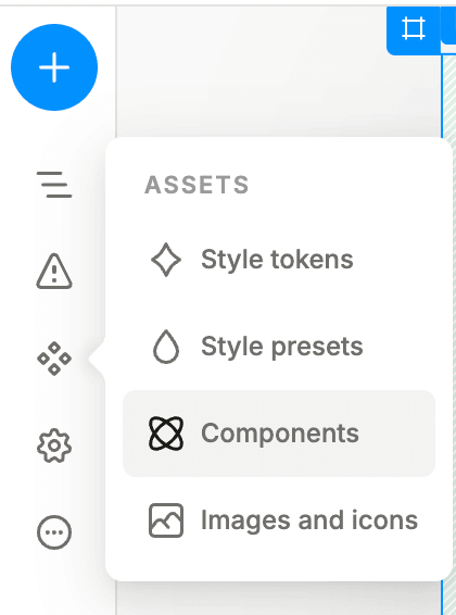
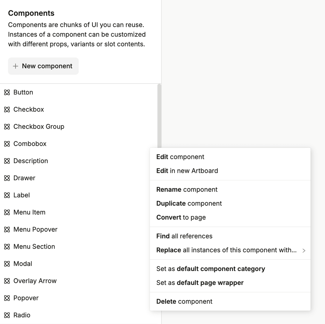
This approach might come in handy when you want to tweak the component without affecting the original source. To create a copy of the component first go to the components library within your project:

Then, select the component you want to copy and click on the “Duplicate” button:

Use case examples:
- You need to do an A/B test on a component, to see if a different design performs better
- You want to have a unique set of radio buttons for a specific form.
- You want to add a data fetcher or provider in the root of your component.
- You want to add some default content to your modal/combobox to reuse it as-is on some pages.
Modifying the base component
You can directly modify the base component to fit your design requirements. This approach is useful when you need to make global changes to a component.
Sometimes you might want to combine this method with creating a copy of a component to avoid affecting other components, as some of the basic components can be an integral part of other components. I.e. changing the Button component will affect all the buttons in your project, including the ones used in Modal Dialog footer, which seems obvious.
But as a not very obvious example - changing the ListBox Item will affect both Combobox and Select components.
In order to modify the component, you can:
- Focus the component, hit (
CMD+Enter) to enter the spotlight mode - Focus the component, hit (
CMD+Option+Enter) to go to the component editing page. - Find the component in the component library or search bar, and click on it.
Use case examples:
- Adding or removing elements (i.e. slots, icons, text, images)
- Changing the default position of elements (i.e. moving the label to the left side)
- Changing the behavior of the component (i.e. adding a new state, changing the default values)
- Adding complex custom styles (i.e. adding a gradient background, animations)
Creating or modifying variants
Variants allow you to create different versions of a component with varying styles or behaviors. This is useful for creating components that adapt to different contexts or states. Refer to this guide to learn more about variants in Plasmic.
Use case examples:
- Creating a loading state for a button
- Allowing different positions for elements (i.e. label on the left or right)
- Creating custom colors for elements (i.e. adding a new color variant for switch)
- Creating a new size for elements
- Adding custom warning for a selected option
- Modifying how a component looks when it’s hovered or focused
Creating new components using react-aria
React Aria gets installed alongside with Customizable Components, and provides a set of headless UI components that are accessible and customizable. You can use these components to build your own design system or extend Customizable Components. We aimed to make Customizable Components as flexible as possible, but sometimes you might need to create a new component from scratch to meet your requirements. Refer to the Plasmic Components Guide to learn more about creating new components in Plasmic.
Using component values
Whenever you add any component that has a value to your page you are able to access it from within data picker in any other place with dynamic values.
In order to change the name of the variable from the default one (let’s say select) just re-name the component you added in the right sidebar.
Working with variant combinations
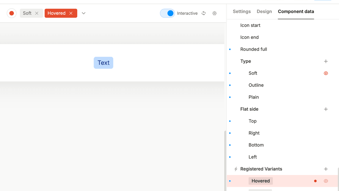
There are situations where you can have two variants at the same time, and you want to make sure that they work together. We use combinations to handle this case.
For example, you might have a button that has a type variant with value Soft and a registered variant called hover.
In this case, we already have a pre-defined combination of those two variants. So if you want to change the hover styles for this given component, you would want to change the combination, not the registered hover variant, because the combination would take the precedence over the registered variant.

Examples
Example 1: Changing the color of buttons
In this video you’ll find two ways of changing the brand color:
- by triggering the component highlight mode, and navigating to the design section
- by changing the value in the token library
Example 2: Create a CTA input for collecting emails
In this video you’ll find a way to duplicate the input component in order to create a new one with a different design, whilst keeping the original one intact.
Example 3: Create a custom switch variant
To continue the further example, we would like to have a switch which would match the styles of the banner. Let’s assume that we would like to use the same type of switch in multiple places further on — therefore we will use variants to implement this.