Tips for building pages
Don’t go overboard with breakpoints. Unless you know you need more, even a single breakpoint may be all you need. Too many will be harder to manage. You can often just make your layouts stretch and/or limit their min-width/max-width to get the look you want, and you can use wrapping on horizontal stacks.
Stress-test your layouts. Make sure each page looks correct on various screen sizes, even ones on the very border of your breakpoints. For instance, if you have a single mobile breakpoint at 768px:
- super-wide desktop (1920px)—will be showing the base variant
- narrowest possible desktop (769px)—will be showing the base variant
- widest possible mobile (768px)—will be showing the mobile variant
- narrowest mobile (320px)—will be showing the mobile variant
Use page and section templates. Use these to get started quickly or even just to get inspiration. They’re there for you to clone and customize! (And shout if there are any templates you’d like to see added.)
Use default styles. Set project-wide default styles to ensure all text and all h1, h2, etc. are consistently styled, without needing to apply styles to each element. (And you’ll be able to easily change everything later.)
Use components. You can define components not just for small atomic parts of your design like buttons, but sections and entire page layouts as well.
Use tokens and style presets. Use tokens, style presets, and components for a consistent design.
Use correct headings. This helps with accessibility and SEO. Each page should have one h1 and any number of h2, h3, etc.
Don’t forget page metadata. Set the page title and description to help with SEO, and set the social media image so that sharing the URL on Twitter/FB/etc. looks good.
Set alt text on images. Images are often used to convey information, and they should have alt text to help all users understand what they’re showing, including vision-impaired users.
Avoid overriding content for responsive variants. Generally avoid content overrides (changing text/images) on mobile and other breakpoint-triggered variants, since these will appear as flashes of the original content before showing the overrides (since JavaScript must run in order to render the overrides). Usually you want to limit your overrides to styles. Learn more.
Learn the shortcuts. A big part of becoming efficient at working in Plasmic is learning its keyboard shortcuts. Whenever you bring up a menu, any relevant keyboard shortcuts are listed to the right of the menu item. Press Shift-? on your keyboard to bring up the shortcut keys quick reference.
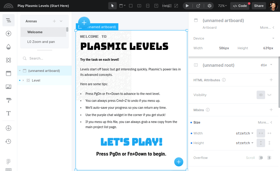
Play Plasmic Levels. We strongly recommend you learn Plasmic concepts through our interactive game, Plasmic Levels. Click here to access Plasmic Levels