Plasmic components
A component is a reusable chunk of UI, similar to symbols in Sketch or components in Figma. You can have small components like Buttons or Icons, large components for a whole Screen or Webpage, and things in between such as Login Form, Tweet, etc. You can have many instances of any component.
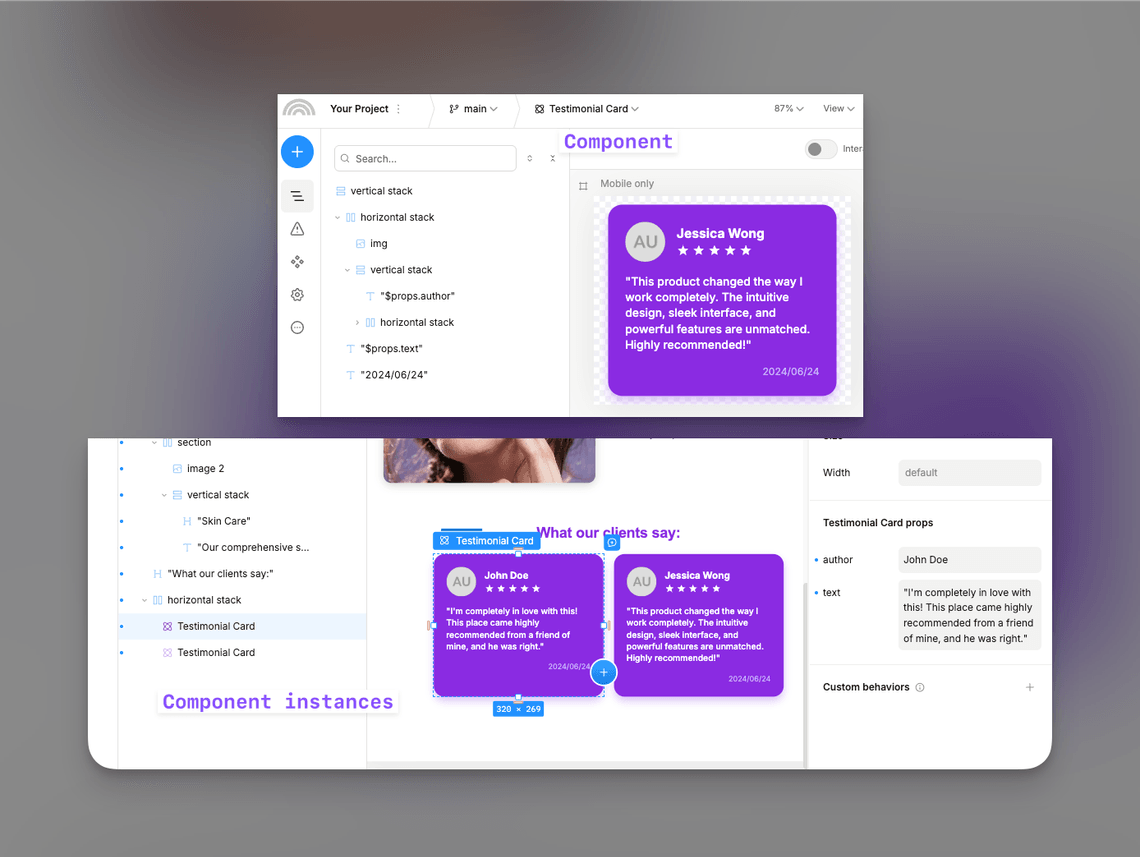
A component is built up of a tree of elements, similar to layers in other tools. These are either primitive elements like boxes, text elements, or input fields, or instances of other components. A component always has exactly one root element, usually a box containing other elements.
How to create a component
There are a few ways to create a component:
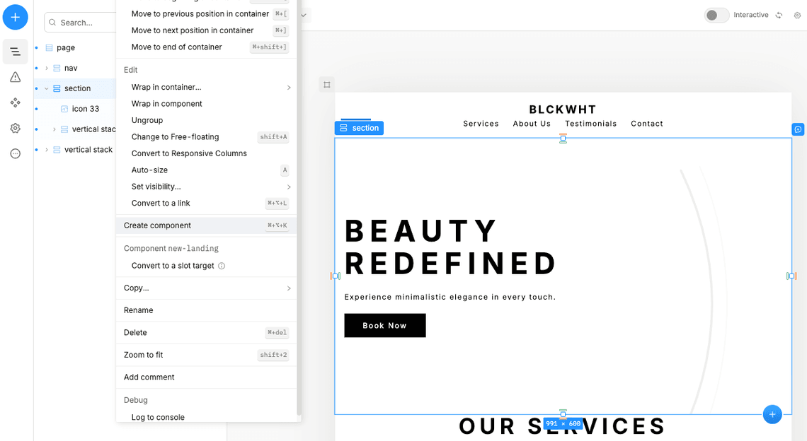
- Let’s say you have already created a banner, and now want to reuse it in another part of your design. To turn existing elements into a component, right-click your banner and select “Create component.” or hit the
ctrl+alt+Kshortcut.
- You can create a new component by clicking the
+button in the top-left list of pages/components.
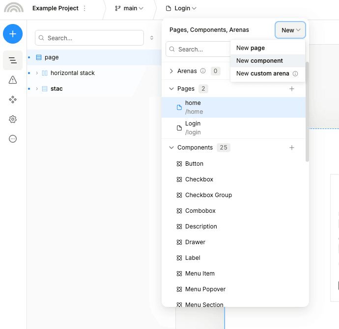
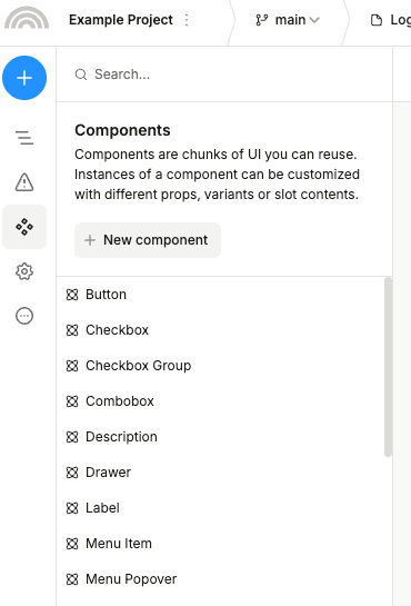
- You can go to Assets -> Components tab in the left sidebar to see all your components and create a new one.
How to edit a component
To edit a component you can:
-
Edit it in place without having to leave the page you are on. To enter the editing mode (we call it “Spotlight mode”), you can either right-click it and select “Edit component” or hit the
ctrl+Entershortcut. -
Go to the component editing page by either navigating to it or by right clicking it and selecting “Go to component”. Alternatively, you can hit the
ctrl+alt+Entershortcut.
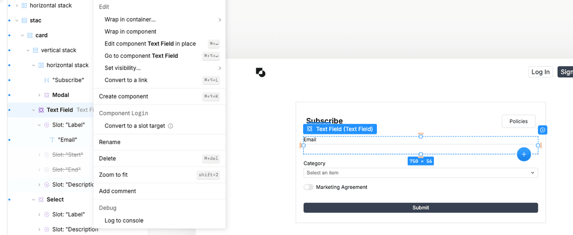
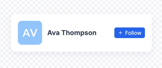
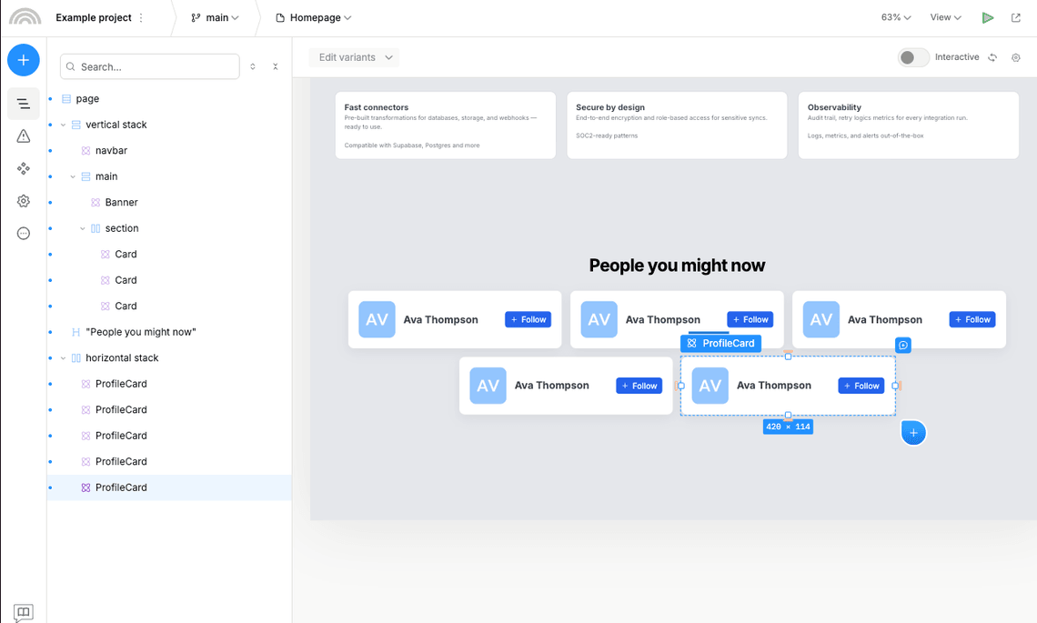
Example: creating a ProfileCard component
Let’s create a profile card containing a picture, user name, and a follow button. Here’s a mockup of how it might look like:
First, we will need to create a new component. We will call it “ProfileCard”
It’s always a good idea to give your components meaningful names, and stick to a consistent naming convention.
Also, you can organize your components and pages into folders - simply use a forward slash (/) in the name of the component or page to create a folder, like this: “Profile / Card”.
Now, let’s add some basic elements to the component:
- One horizontal stack in the root of the component to act as a wrapper. It will have a “between” horizontal alignment, “center” vertical alignment, a white background, rounded corners, a small padding, and a shadow.
- Nested horizontal stack for user data, and a Button component with a “Follow” label, and ”+” as the start icon.
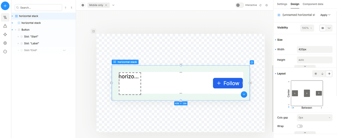
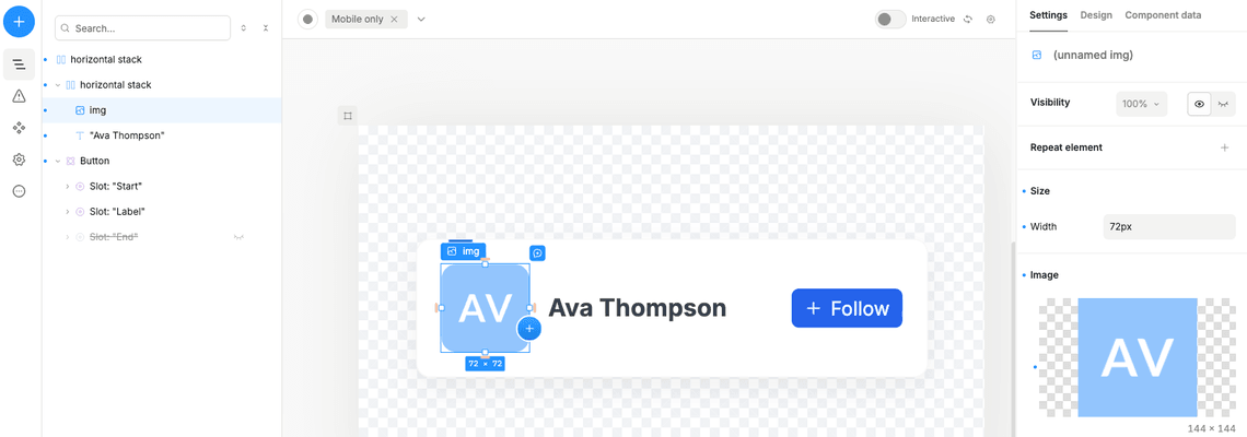
Next, let’s add the content — a profile picture and a user name. Set the nested horizontal stack to have a “center” vertical alignment, and add a profile picture and a user name and some column gap.
Then insert the Image component, and a text with some user name:
Once you have built a component, you can add instances of that component in other artboards anywhere you can add normal elements. You can thus compose instances of smaller components into larger and more complex components. Below, we drop in three instances of the ProfileCard into a new artboard.
Components as a unit of publishing
Besides reuse in your Plasmic designs, the other reason to create components is to publish content that isn’t a full page, but instead is just a section of a page.
Let’s say you already have a landing page in your codebase, and just want to make a part of it editable.
-
The hero (or any section) of the page:

-
A site-wide announcement ribbon:

-
A special offer modal:

Rather than create a full page out of these, complete with URL route and SEO metadata, you can instead just create these as components. Then your codebase can render these where it needs.
Next steps
Now that you know how to create and edit components, you can learn about other core concepts that are used to customize and extend your components:
- Props - how to add custom properties to your components.
- Slots - how to add arbitrary content to your components.
- Variants - how to create different variations (versions) of your components.