Props
Props (short for “property”) are settings to configure on a component instance. Props enable you to customize individual instances of a component. There are two more ways to customize component instances - Slots and Variants.
Consider a Profile Card component, with a name and a profile picture.
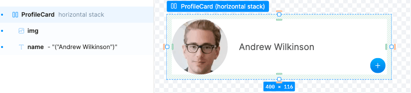
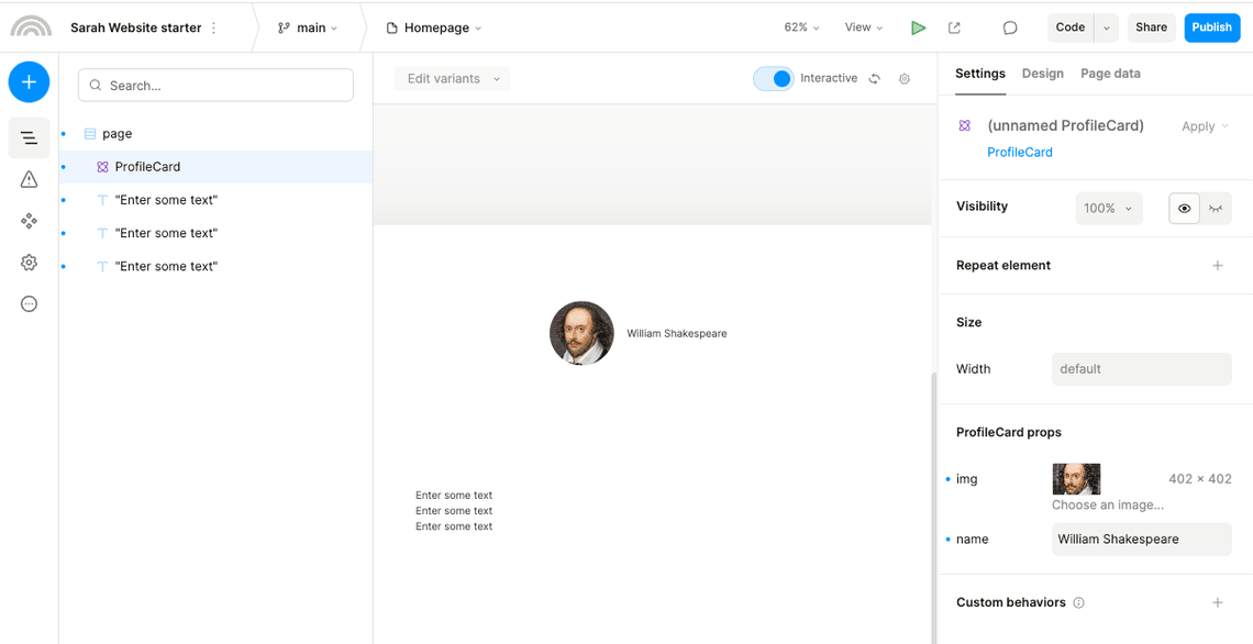
We can create the component and add the name and img props. Then every component instance can have its own values for name and img.

Adding Props
There are two ways to add props to a component:
-
Say you just want to expose an existing setting of an element in your component. You can right-click that setting and “Link” it as a prop on the outer component. Check out Allow External Access section for more details.
-
You can directly add custom props, of varying types, to your component. Add these from the Component Data tab in the right sidebar. You can specify what type it is there, such as text, image, or data. (explained below via the
nameprop)
To understand the above two ways of adding props, consider again the Profile Card component described above. We will go through the steps to create its name and img props. You can also follow along with this Plasmic project.
Adding Props Directly
Create the component using the instructions in the Components section. Then, switch to the Component Data tab, and under Props section, click the + icon.
Fill in the prop details in the New Prop modal, then Confirm.
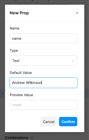
The name prop should now be created.
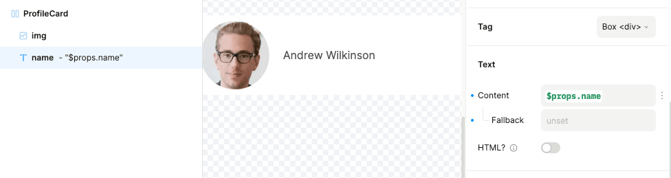
Now we want to link the name prop to the name content in the Profile Card. To do that, find the Text component in the Outline tab. Set a dynamic value on its Content prop.
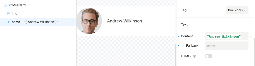
In the “Select data” modal that appears, select the name prop.
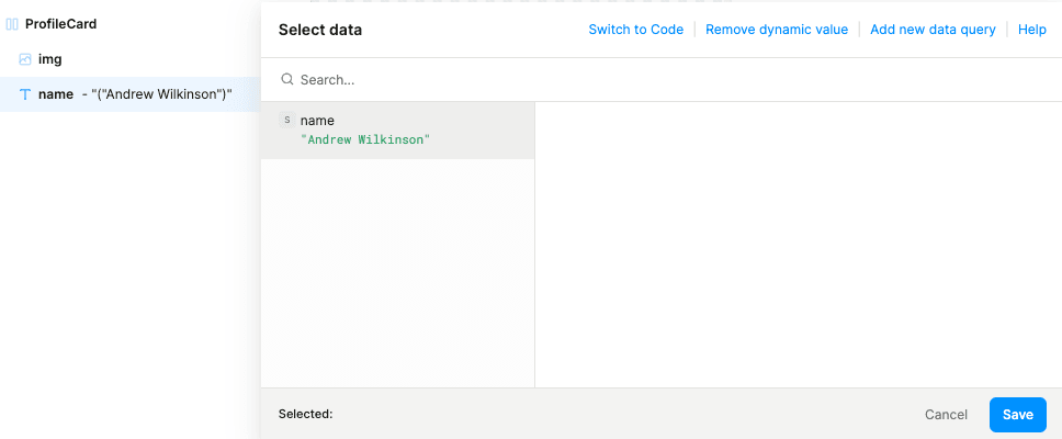
The name prop should now be linked to the text in the Profile Card.
Allow external access to a component setting
You are able to create props by exposing the setting of a component. Using this functionality you can allow external read/write access to almost any setting of a component.
As an example we will link the profile image source setting to an image prop.
To do that, find the img component in the Outline tab. Then, find its built-in Image setting. Click on the menu icon next to it, hover over “Allow external access”, and select “Create new prop” option to create a new img prop for the ProfileCard.
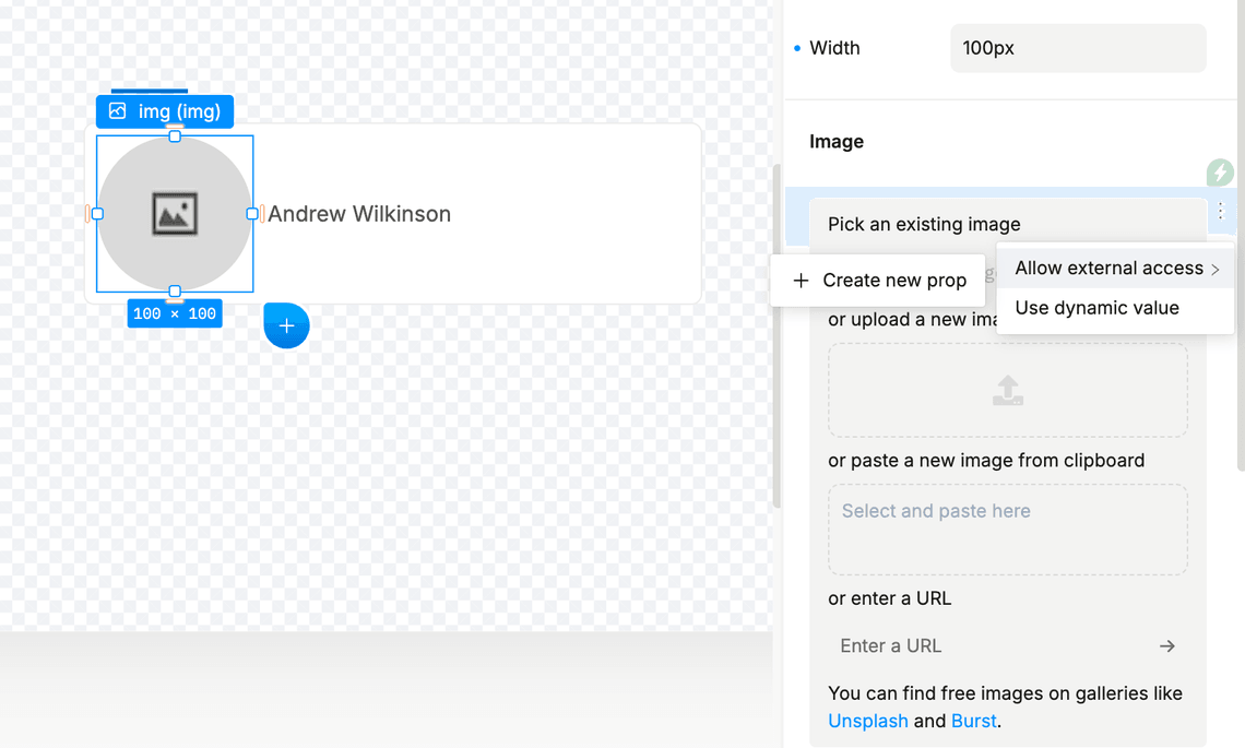
You will see a prompt, which will ask you about the desired name for the prop. It will be used both in the settings tab and in the data picker.
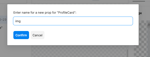
The img prop should now be created and linked to the profile picture in the ProfileCard.
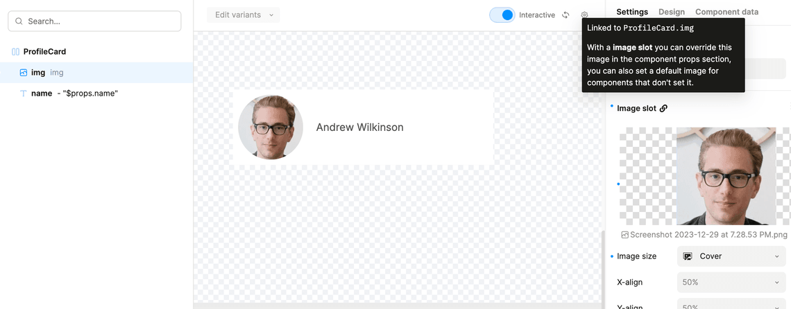
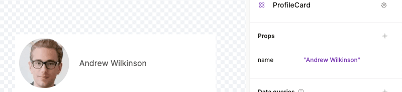
You should now see the name and img props in the Component Data tab.
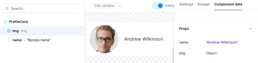
Instances of this component will allow setting values of these props in the Settings tab.
You can take any element in the component and expose its non-style attributes as props.
A note on slots
You could expose a bunch of slots to fill in the user’s name, bio, profile, links, etc., as well as expose variants controlling whether the user is shown as a staff user, new user, etc. But you’d need to fill this in per component.
A more scalable approach is to expose props for the user’s data. This data likely may be queried straight from some database or API. Then you can just pass in that chunk of data, and then from within the component, you can have your various elements wired up to the prop (using dynamic values), as explained above. See this Plasmic project for an example of this use case.
Moreover, slots are more suitable in situations where you want to add a custom node. However, if all that’s changing is some text or a configuration, then props are the recommended approach.
More Examples
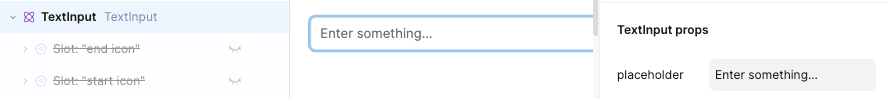
Input component
If you have an Input component containing an input textbox, you can expose the placeholder as a prop of the Input component, so that each instance of Input can specify its own placeholder.
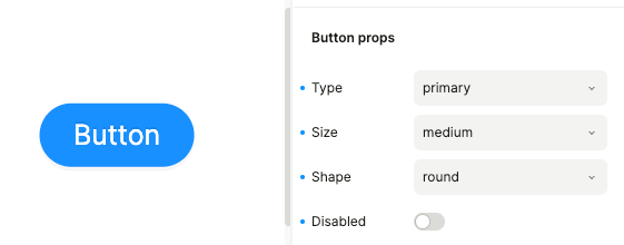
Button component
If you have a Button component, you can expose props such as:
- size (large/medium/small)
- shape (round/cornered)
- type (warning/submit)
Each instance of “Button” can specify its own prop values. So, for example, a Call-to-Action button can be large in size, but an Ok button can be medium sized.
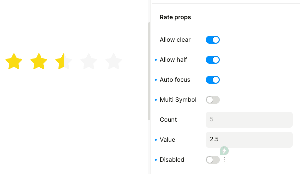
Rating component
A Rating component can expose props such as:
- maximum rating (e.g. 5 star or 10 star rating)
- whether decimal ratings are allowed (allow half)
- whether the rating is read-only (disabled) or editable
Each instance of Rating can specify its own prop values. So, for example, an existing book review can have a read-only rating, but if you are adding your own review for that book, you would want a rating component that is editable.
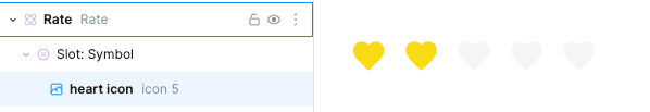
Adding custom nodes using slots
In the Rating example, if you want to customize the rating icon (having a default icon of star), you can use a special kind of prop - a slot! This is because slots let you add custom nodes to a component.
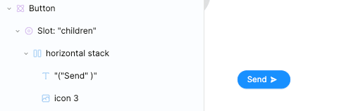
Likewise, in the Button component, you can add custom content to the button (e.g. “Send” text with a send icon) using a slot.