Element variants
Element variants are a powerful feature that is similar to the interaction variants, but it has some key differences:
- They can be applied only to a Plasmic basic element (heading, text, image, link, etc.).
- You can apply them only to a single element, not the entire component, which means that you can’t change anything that is nested within an element variant.
- They can be used in place, meaning you don’t have to create a separate component in order to create a variant for it.
The main use case of element variants is to change the element design in different states. It is similar to Interactions, but element variants are applied based on CSS arbitrary selectors (such as :hover, :first-child, :disabled, etc.) rather than JS events, which can sometimes be more versatile.
How to use element variants
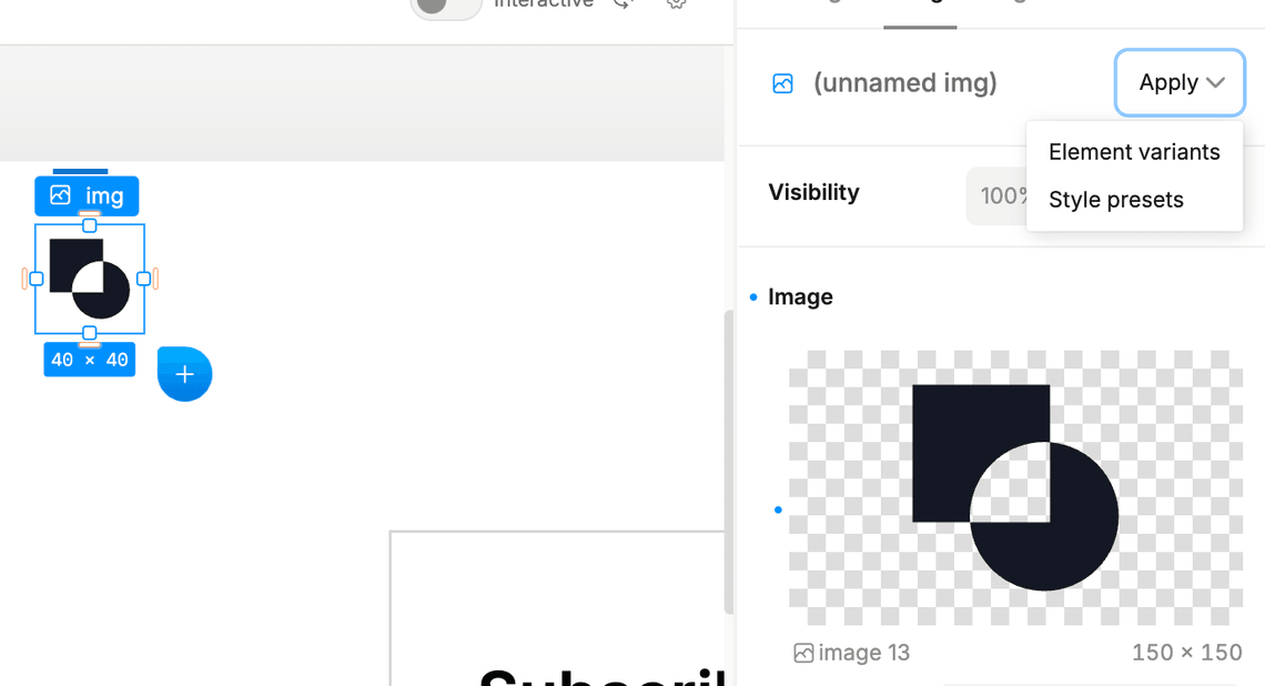
First, select your element in the arena, then go to the right sidebar. Navigate to the Design tab and open the Apply dropdown:
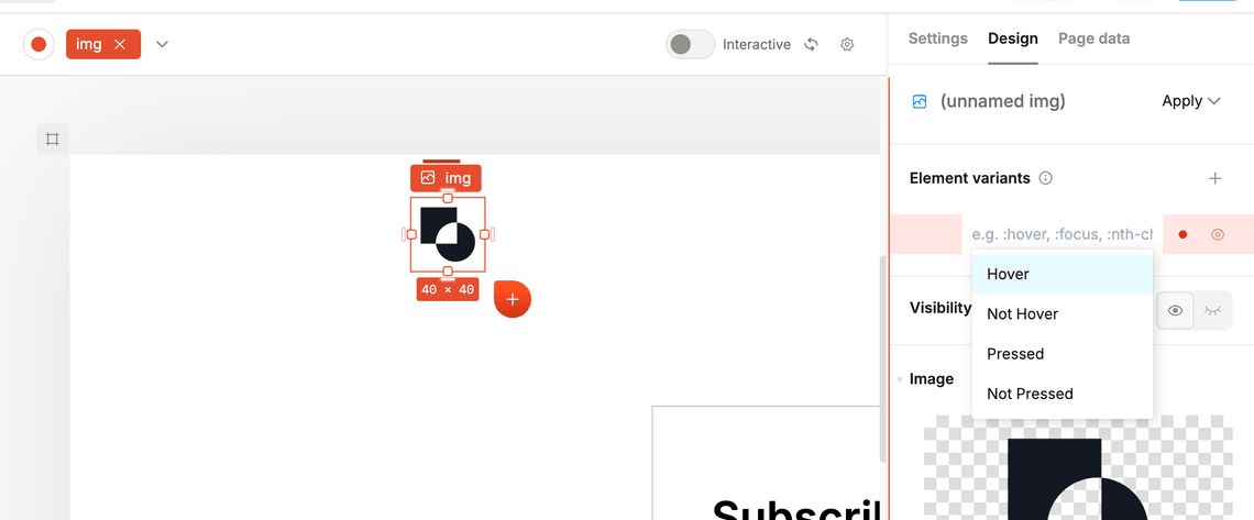
Click on the element variants option in the dropdown, and then hit the + button to add a new variant. You can then select the CSS selector that will be used to apply the variant. This can be any valid CSS selector, such as :hover, :first-child, :disabled, etc. Pressing Enter will start recording the styles for the variant. Style the element as you normally would with variants, and then stop the recording.
Example
In the following video, we will provide a deeper explanation of the differences and walk through the process of creating an element variant for a card:
Have feedback on this page? Let us know on our forum.