Global variants
Earlier we described variants, which are always specific to a component or an element. For instance, the primary variant of a button.
Global variants are similar to normal (component-specific) variants, in that components can appear differently in different global variants. However, global variants apply across the entire project, meaning that any component can have specific style settings defined under a single “Dark mode” variant.
Global variants use cases
Besides dark mode, there are many other use cases for global variants, where you want many components in the app to change together:
- Screen size — mobile vs. desktop
- Color pallette — light/dark mode, sepia, high-contrast etc.
- Translations — different languages, LTR vs. RTL layouts
- Configurable layouts — a closest example would be Gmail’s roomy vs. dense mode
- Vendor-specific brand — different branding colors for different vendors
For instance, a global variant for iOS-styled look vs. Google’s Material UI might switch over the look of many components:

How to create a global variant
To create and manage a global variant:
-
Select any element in a component or a page
-
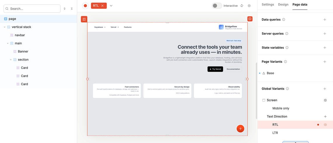
Navigate to the Page (or Component) Data tab, and scroll to the bottom to find the “Global Variants” section.
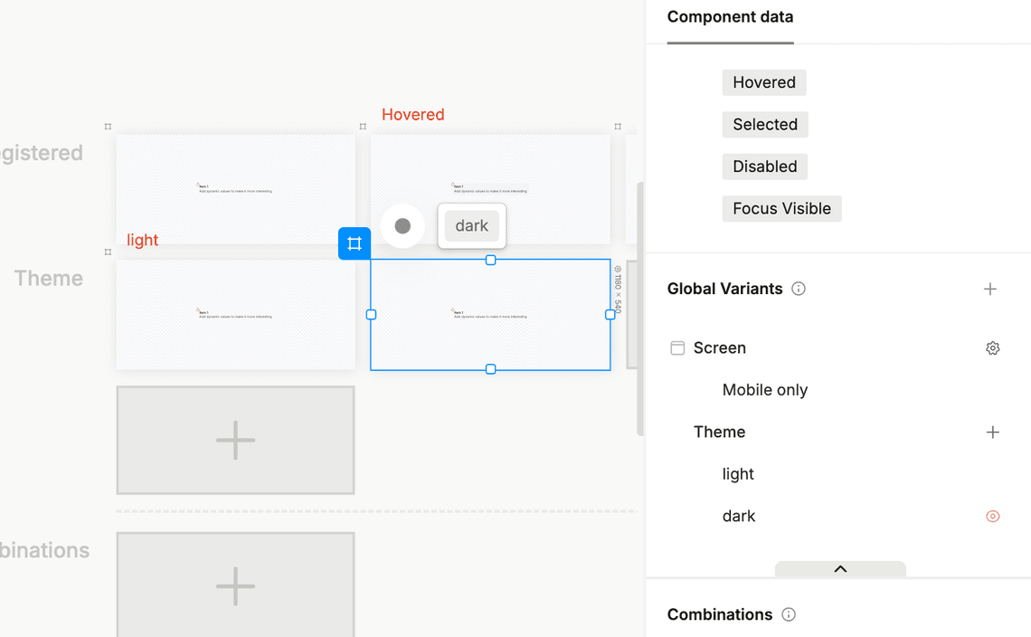
-
You’ll see the global variants listed, with the ability to create more. Click the
+button to create a new global variant group. -
Let’s call it “Text Direction”, and create two variants in this group: “RTL” and “LTR”.
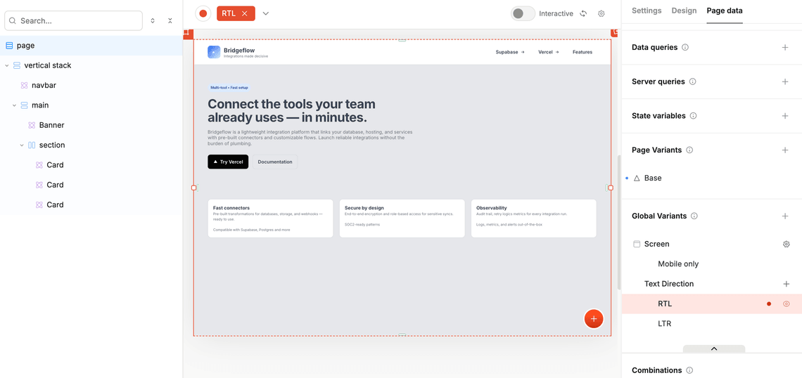
- LTR would not need any changes because it would be the same as the base variant, so let’s select the RTL variant and apply the changes to all the components that are present on this page:
- Now, go back to your page, and switch to the RTL variant — you’ll see that the text direction has changed:
Responsive design using screen variants
There’s a special global variant group called “Screen” variants, built in to all projects. These are treated specially because they can specify min and max viewport widths at which they kick in. For instance, if you’re doing mobile-first design but want to make adjustments for the desktop, you can create a screen variant called “Desktop” that activates on devices over 300px wide. Then, whenever you have an artboard that is over 300px, this Desktop variant will be automatically shown by default.
To learn more, see responsive design using screen variants.
Switching between global variants during runtime
While Plasmic Studio doesn’t support switching global variants based on user interactions out of the box, you can implement this functionality by setting up your app host to manage the variant state.
This example requires setting up an app host connected to Plasmic Studio and basic knowledge of React concepts like context, hooks, and components.
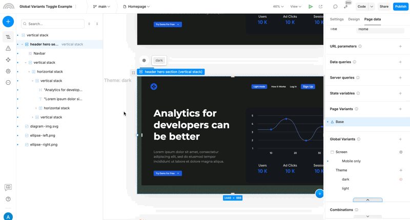
As an example, we’ll build a dark mode switcher that toggles between light and dark themes. You can inspect the resulting demo and source code in this repository, or follow a step by step guide:
- Create a global variant group in Plasmic Studio called
Theme, and two global variants namedlightanddark.
In order to do that go to any page or a component, and in the right sidebar select the Page (or Component) Data tab. Then scroll to the bottom to find the Global Variants section and hit the + button to create a new global variant group:
- Create a React context to manage the global variant state:
// contexts/GlobalVariantContext.tsx// (optional) persist theme preference in cookiesimport { getCookie, setCookie } from 'cookies-next';import React from 'react';// Cookie name for theme preferenceconst THEME_COOKIE_NAME = 'plasmic-theme';interface GlobalVariantContextType {isDarkMode: boolean;toggleDarkMode: () => void;}const defaultContextValue: GlobalVariantContextType = {isDarkMode: true, // Default to dark mode if not settoggleDarkMode: () => {}};const GlobalVariantContext = React.createContext<GlobalVariantContextType>(defaultContextValue);export function GlobalVariantProvider({ children }: { children: React.ReactNode }) {// Load theme preference from cookie on mountconst [isDarkMode, setIsDarkMode] = React.useState(false);React.useEffect(() => {const savedTheme = getCookie(THEME_COOKIE_NAME);setIsDarkMode(!savedTheme || savedTheme === 'dark');}, []);const toggleDarkMode = () => {setIsDarkMode((prev) => {// Save the new value to cookiessetCookie(THEME_COOKIE_NAME, !prev ? 'dark' : 'light');return !prev;});};return (<GlobalVariantContext.Provider value={{ isDarkMode, toggleDarkMode }}>{children}</GlobalVariantContext.Provider>);}export const useGlobalVariant = () => {const context = React.useContext(GlobalVariantContext);return context || defaultContextValue; // fallback inside Studio preview};
- Pass the name and the active value of the variant that you want to change into the
PlasmicRootProvider:
// components/PlasmicWrapper.tsximport { PlasmicRootProvider } from '@plasmicapp/loader-nextjs';import { useGlobalVariant } from '@/contexts/GlobalVariantContext';type PlasmicWrapperProps = React.ComponentProps<typeof PlasmicRootProvider>;export function PlasmicWrapper(props: PlasmicWrapperProps) {const { children, ...rest } = props;const { isDarkMode } = useGlobalVariant();return (<PlasmicRootProvider {...rest} globalVariants={[{ name: 'Theme', value: isDarkMode ? 'dark' : 'light' }]}>{children}</PlasmicRootProvider>);}
- Wrap your loader app with
GlobalVariantProvider:
// pages/[[...catchall]].tsxexport default function PlasmicLoaderPage(props: {plasmicData?: ComponentRenderData;queryCache?: Record<string, unknown>;}) {const { plasmicData } = props;if (!plasmicData || plasmicData.entryCompMetas.length === 0) {return <Error statusCode={404} />;}const pageMeta = plasmicData.entryCompMetas[0];return (<GlobalVariantProvider><PlasmicWrapper><PlasmicComponent component={pageMeta.displayName} /></PlasmicWrapper></GlobalVariantProvider>);}
- Create a wrapper component to pass the current state and actions to the Studio:
// components/DarkModeToggleWrapper.tsximport React from 'react';import { DataProvider } from '@plasmicapp/loader-nextjs';import { useGlobalVariant } from '@/contexts/GlobalVariantContext';interface DarkModeToggleWrapperProps {children?: React.ReactNode;}interface DarkModeToggleWrapperActions {toggleTheme(): void;}const DarkModeToggleWrapperBase = ({ children }: DarkModeToggleWrapperProps, ref: React.Ref<unknown>) => {const { isDarkMode, toggleDarkMode } = useGlobalVariant();React.useImperativeHandle(ref, () => ({toggleTheme: toggleDarkMode}));return (<DataProvider name="theme" data={{ isDarkMode }}>{children}</DataProvider>);};export const DarkModeToggleWrapper = React.forwardRef<DarkModeToggleWrapperActions, DarkModeToggleWrapperProps>(DarkModeToggleWrapperBase);
- Register your code component to make it available in Plasmic Studio:
// plasmic-init.tsPLASMIC.registerComponent(DarkModeToggleWrapper, {name: 'DarkModeToggleWrapper',props: {children: 'slot'},providesData: true,refActions: {toggleTheme: {argTypes: [],displayName: 'Toggle dark mode',description: 'Toggles between light and dark mode'}}});
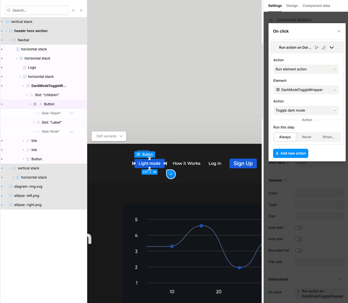
-
Use the
DarkModeToggleWrappercomponent in Studio to wrap the UI element that would act as a toggle (a Button, for example) -
Use your Theme global variant to style the button in the light and dark modes. Alternatively you can use the
isDarkModeprop passed to the component. -
Add an
onChangeinteraction to the UI element to call theToggle dark modeelement action.