Responsive design with screen variants
The simple approach: use responsive columns
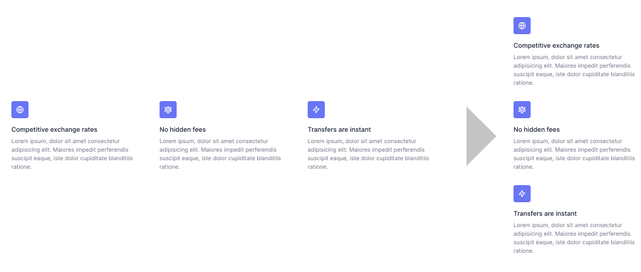
Most of the time, when you want some part of your page to be responsive, you simply want the layout to be a horizontal stack on desktop, and a vertical stack on mobile. For example:

You can achieve this easily by inserting a “Responsive Columns” element. You can adjust its layout settings from the right sidebar. It automatically stacks all columns vertically on the smallest breakpoint.
Breakpoints (a.k.a. screen variants)
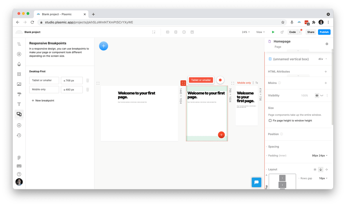
Every Plasmic project has a set of breakpoints defined. A breakpoint is a screen width at which you want designs to look different. For example, you might have the following two breakpoints defined:
- Screens less than 768px wide—let’s call this breakpoint “Tablet or smaller”
- Screens less than 480px wide—let’s call this breakpoint “Mobile only”
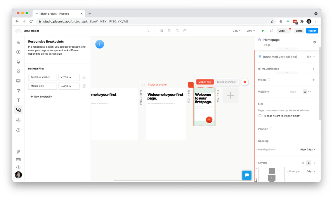
When you’re editing a page or component, you’ll see a toolbar with any breakpoints that match the current artboard width. Click the breakpoint you want to “record changes” to (things will become red), and any edits you make will be for that breakpoint.


Breakpoints are always cumulative. With the above two breakpoints, a screen that is 400px wide will match both “Tablet or smaller” and “Mobile only.” (You can’t define a breakpoint that’s, say, “between 768px and 480px wide”—there is only ever a start and never an end to the range.)
Breakpoints are also called “screen variants”—see further down for an explanation.
Warning: change styles only!
When you are recording overrides specific to a breakpoint, be sure to stick to only style changes (on the Design tab).
Generally avoid content overrides (changing text/images) on mobile and other breakpoint-triggered variants, since these will appear as flashes of the original content before showing the overrides (since JavaScript must run in order to render the overrides). Usually you want to limit your overrides to styles.
Screen artboards
When editing pages, you’ll see a set of screen artboards in the main canvas area. These usually (but don’t always) correspond one-to-one with the breakpoints you defined.
The set of screen artboards is always the same for all pages.
You can click the big Plus button in the canvas to add a new screen artboard. We recommend ensuring a screen artboard is created for each breakpoint. You’ll see a warning icon next to breakpoints that don’t have a dedicated matching screen artboard.
Reasons you may want a different set of screen artboards than variants:
- Screen artboards correspond to no breakpoints
Defining breakpoints
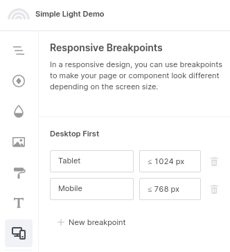
To update your responsive breakpoints, navigate to the “Responsive Breakpoints” tab on the left. Here, you can name and set your breakpoints.

You can also choose whether your project will be desktop-first, or mobile-first.
Breakpoints and variants
Breakpoints are also called “screen variants.” Breakpoints are similar to any other variant. They are specifically a special global variant group called “Screen”.
The only differences with normal variant groups:
- Screen variants are specially activated based on the browser window size.
- Screen variants are always cumulative, as described above.