Default components
All Plasmic projects come with the ability to insert a built-in version of each of these types of components:
- Button
- Select
- Checkbox
- Switch
- Text Input
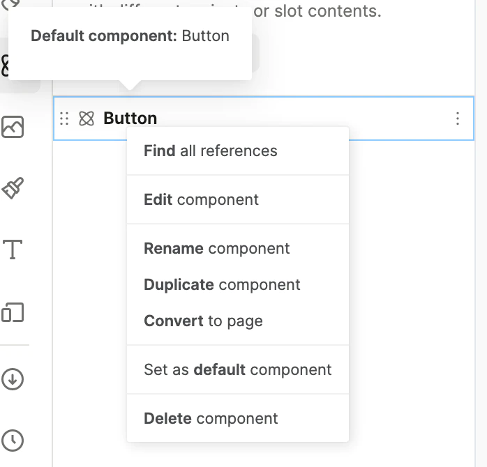
But you don’t have to use these Plasmic built-in components—you can now leverage the default components system to designate your own choice of components (such as from your org’s design system) to replace the built-in ones in Plasmic.
For example, if you designed your own Button component, you can designate that as the default Button component for your project. This way, users in the Plasmic project will only see your Button component and not the Plasmic built-in Button component.
Another use case is code component templates. Developers have been able to make code components come with a more complete example template, to make it easier for editors to use the code components. (These are defaultValues for slots.)
Within these templates, you can now include instances of a project’s default components. For more on this, see the reference API.
Have feedback on this page? Let us know on our forum.