Creating forms
Before using forms, you should already be familiar with interactions.
Plasmic includes a built-in form component for quickly building forms, from simple to complex.
Videos
Configuring fields
Fields are configured in the form’s settings.
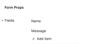
To add a field, click “Add item”, and a dialog should pop up for configuring the field.
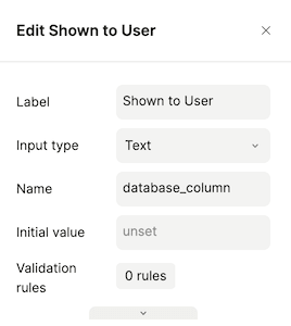
Here are the most important settings for each field:
- Label - text shown to the user, adjacent to input control (e.g. “Name”, “Address”)
- Input type - type of input control to show (e.g. “Text”, “Number”)
- Name - identifies the field when using the form’s state (usually this should match your database column name)
- Initial value - the value the input control starts with
- Validation rules - see validating fields
To edit an existing field, click a field to open the dialog again.
To delete or reorder fields, hover over a field to reveal delete and reorder buttons.
Validating fields
You can configure your form to validate its fields before submission. Select the field you want to add validation rules for and click the “Validation rules” field.
The following validation rules are supported:
- Is required
- Minimum length
- Maximum length
- Must be one of
A sensible error message is chosen depending on the validation rule, though you may set your own error message to fit your app’s use case or branding.
By default, a field’s validation rules are checked whenever the user changes the field. You can also configure validation to run when a field loses focus (i.e. user clicks out of a field or another fields gains focus) or when the form is submitted. Validation triggers can be configured in the form’s settings.
Using form state
A form’s state consists of all its fields’ states. A form takes care of bundling all field values into one JSON object. Like other interactive components, the form’s state is available for use in dynamic values.
Suppose a form has a field with name “givenName” and a field with name “familyName”. Then the form’s state will be:
{"givenName": "Alex","familyName": "Smith"}
This bundle of field values is often submitted directly to a data query, such as when creating a row in a database. You just need to make sure the field names and the database column names match.
More features
Component mode
By default, a form element is in simplified mode, allowing you to configure all fields under the form’s settings. If you turn off simplified mode, fields must be configured individually as elements in the form, allowing you greater flexibility in layout and design.
To add a field when simplified mode is off, go to the form’s settings and click “Append new Form Field”. You should see a new field appended at the bottom of your form with a label and control.
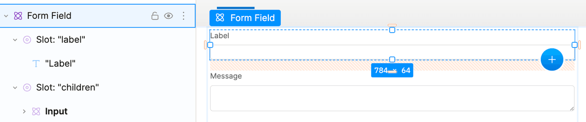
By default, a text input is created as the control. You can replace this with other input types by deleting the text input in the “children” slot and inserting a different type of input.
Don’t forget to set a name in the field’s settings. The field’s name identifies the field in the form’s state.
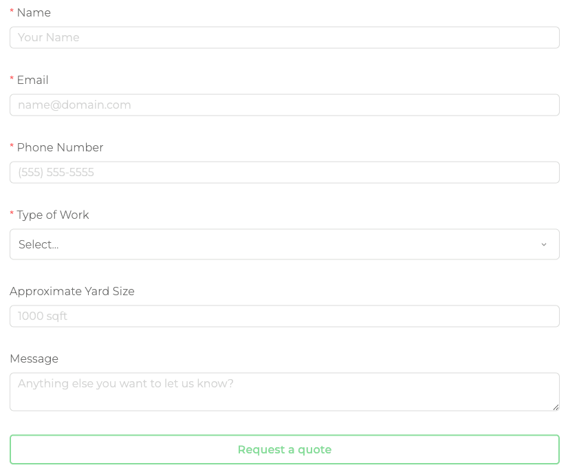
Form layout
By default, a vertical layout is used for the form. This is a good default since it works well on both desktop and mobile.
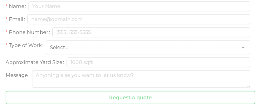
For desktop apps with more horizontal space, an inline layout or horizontal layout may be preferable. Here’s an inline layout:
Here’s a horizontal layout:
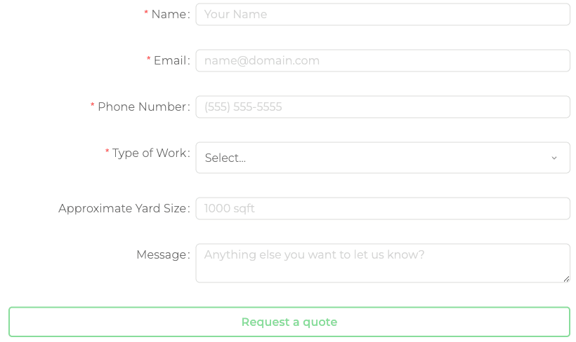
The horizontal layout positions labels and controls into two columns. The width and offset of labels and controls can be configured in the form’s settings. The width and offset are based on a 24 column grid. By default, the label has width 8 and the control has width 16, meaning the label takes 1/3 of the form’s width and the control takes 2/3.
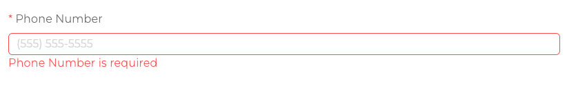
Required and optional indicators
When using the required validation rule, the form can automatically indicate which fields are optional or which fields are required with an asterisk.
To enable this for your form, go to your form’s settings and find the “Required/optional indicators” field.
Custom validation rules
If the built-in validation rules don’t work for you and you’re familiar with JavaScript and dynamic values, try using the “Custom Validator” rule. The dynamic value should read the value of the input, process it, and return a boolean value.
For example, to validate an input starts with a dollar symbol ($), the dynamic value should look like $state.formName.value.inputName.startsWith('$').
HTML form submission
HTML form submission requires an existing server that accepts form data.
Besides using the built-in form component, you can also designate a container to be an HTML <form> to send an HTTP request with form data to an existing server.
Here’s a video showing this: