Code components API reference
registerComponent
The registration function takes a component and some metadata about it:
PLASMIC.registerComponent(component: React.ComponentType<any>,meta: CodeComponentMeta,): void
The first parameter component is the React component function or class that you want to register and use in the Studio.
Component metadata fields
The second parameter meta is an object containing metadata about the component. The object contains the following fields:
| Field | Required? | Description |
|---|---|---|
name | Yes | A unique string name used to identify this component. Each component should be registered with a different name. This name should be a valid javascript identifier, and we recommend picking a name that matches the component’s name in code. |
props | Yes | An object specifying the props expected for this component. Each key of the object is the name of the prop, and the value is metadata about the prop. See Property types for more. |
actions | No | An array specifying the editor actions for this component. Each element of the array is an object with the type of the action and its metadata. See editor action controls for more. |
displayName | No | A human-friendly name to be displayed for the component in Studio UI; can contain spaces and punctuations. |
description | No | A human-friendly description for what this component does; will be rendered as helpful text to Studio users. |
section | No | The section in which the component should be shown in Studio. If not specified, the component will be shown under the “Custom components” default section. |
thumbnailUrl | No | A small image (as a URL) of the component to be shown in Studio. Only shown if the component has a section specified. |
classNameProp | No | The prop that takes in css classes and applies it to the root element. If not specified, defaults to className. |
refProp | No | The prop that receives and forwards a React ref. Plasmic only uses ref to interact with components in the editor, so it’s not used in the generated code. If not provided, the usual ref prop is used. |
refActions | No | An object specifying element actions for this component. Each key of the object should correspond to a function on the code component’s ref. See Element actions for more. |
defaultStyles | No | A CSSProperties object with styles to be applied whenever an instance of the component is created in the Studio. See below section on styles. |
templates | No | An array of JSON objects describing templates to start with when creating instances of the component. Each key of the object is the name of the template, and each value is a template object; see the template types section. |
isAttachment | No | If true, the component will be registered as an “attachment”. That is, the component will be available in the Custom Behaviors section on the right panel of Studio to be used as a wrapper component. See Custom behaviors for more. |
providesData | No | Must be true if the component provides data to its slots using DataProvider (imported from @plasmicapp/host). |
styleSections | No | You can specify a list of style sections that the Plasmic Studio user should be allowed to use when styling this code component. You can set to false if this code component should not be styled (because it does not render any DOM elements, for example). You can set it to [] (empty list) if this code component does support styling (takes in a className prop and puts it on the root DOM element), but you don’t want to allow any styling besides basic positioning (position and margin). You can set it to true if this code component should have all the default style sections available, does take in a className prop, even if Plasmic Studio can’t detect the className prop being used. See style section options. |
parentComponentName | No | Within Plasmic Studio’s insertion menu panel, list this component as nested under the specified parent component. |
hideFromContentCreators | No | Within Plasmic Studio’s insertion menu panel, do not list this component when the user is a content creator. Appropriate for more advanced components or components that are more appropriate for designers. |
variants | No | An object specifying the registered variants for this component. Each registered variant is defined as a key-value pair, where key is the variant name, and the value is an object with a cssSelector which will be used to apply the variant created from the Studio, and a displayName which will be shown in the UI. |
| Codegen only: | ||
importPath | Yes | The path to be used when importing this component in the generated code. It can be the name of the npm package that contains the component (antd), or the path to the file in the project (relative to the root directory, where the plasmic.json file is located). |
isDefaultExport | No | If true, then this component is the default export from importPath. |
isRepeatable | No | If false, then this component cannot be made repeatable in Plasmic Studio. |
importName | No | If the component is not the default export, then it is a named export from importPath, named importName. Default to using name if not specified. |
Properties passed to the registered component
When your component is registered and instantiated in the Studio, Plasmic will pass in the following additional properties to the component by default:
| Property | Description |
|---|---|
plasmicNotifyAutoOpenedContent | Call this function to notify Plasmic that the component has been auto-opened in the Studio. See example here. |
plasmicUpdateVariant | Updates the currently applied variants of the component. Read more on how to use this in the registered variants page. |
__plasmic_selection_prop__ | If true, then the component is selected in Studio. Don’t use directly, instead use the usePlasmicCanvasComponentInfo hook to access this information. |
setControlContextData | Sets the control context data, to dynamically update the prop control options in Studio. Go to prop control functions docs to get more information and see code samples. |
className | The Plasmic-generated class name of the component. This is how styles from the design tab are applied to the component. |
Prop Metadata
You can specify a lot of metadata about each prop of your code component; this helps Plasmic understand what each prop expects as an argument, so that Plasmic can generate the right UI in the Studio for users to configure these props.
Prop types
The main piece of prop metadata is the type of value expected for the prop. Here are the types we currently support:
| Type | Prop value type | Description |
|---|---|---|
string | string | Configured via a text input box in the Studio |
boolean | boolean | Configured via a toggle switch in the Studio |
number | number | Configured via a number input box or a slider |
dateString | string | Configured via a date picker in the Studio; handles dates in ISO string format |
dateRangeStrings | string | Configured via a date range picker in the Studio; handles dates in ISO string format |
code | string | Configured via code editor in the Studio. See more. |
href | string | A link; Studio will show a link picker that lets the user either choose a page in the Plasmic project, or type an arbitrary url. |
imageUrl | An image URL as a string | Configured via the Studio image picker; useful for picking an image asset uploaded to the project |
color | string | Accept a color. The color is by default always a hex value, but can also be configured to a css variable reference. See more. |
object | JSON object | Configured via a text editor for arbitrary JSON values, including objects or arrays. See more |
array | JSON array | An array of objects; configured via a list-builder UI in Plasmic studio. See more |
eventHandler | function | Registers an event handler prop, like onChange or onSelect. Plasmic studio users will be able to add interactions for these events in the editor. See more |
slot | ReactNode | Works just like normal Plasmic component slots, for props that expect React elements. See more. |
choice | string or string[] | A select dropdown or a multi-select, for picking from an enumeration of possible string choices. See more. |
cardPicker | string | Works just like the choice type, but it renders a modal for picking the option from an enumeration of possible cards with an image and footer. See more. |
class | string | Allows studio user to style a specific part of the code component. A css class name will be passed in as the prop value, which the code component should apply to the right element. See more. |
themeResetClass | string | A css class name will be passed in as the prop value, which will apply the Plasmic-defined default styles. Useful when you are rendering content in a React Portal. See more. |
As a convenient shorthand, if you don’t care about other prop metadata, then you can just pass in the type string as the prop metadata:
registerComponent(MyComponent, {name: 'MyComponent',props: {children: 'slot',color: 'string'}});
Common options
Here are the common options you can specify in the prop metadata object. Most of them are optional, but specifying them will help Plasmic understand them better, and make them easier to use for Studio users.
| Field | Required? | Description |
|---|---|---|
type | Yes | One of the supported prop types |
displayName | No | The human-friendly readable name to show in the Plasmic UI for this prop. Can contain spaces and punctuation. |
defaultValue | No | The default value that should be provided to the prop. If not present, and no value is passed when the component is instantiated, Plasmic won’t provide any value. For slots, the default value can be an “element” or array of elements; see element types. |
defaultValueHint | No | The default value that is assumed if no value is specified. It is displayed as a placeholder when possible. Not applicable to slot type. |
required | No | Specifies whether this prop must have a value set for the component to function correctly. If the prop is not provided, an error indicator will be displayed. |
validator | No | A function that validates the current prop value. It receives the value and the prop control functions, and returns either true if the value is valid or an error message to be displayed if it is not. |
editOnly | No; defaults to false | A boolean indicating whether the values passed to that prop should only be used in the Studio, and not in real generated code. For example, you might have props that are only there to support Studio editor usage (like a prop that turns off animations or auto-play in the Studio). Another common example is a prop like value, which “controls” the value of, say, a TextInput component; in the Studio, it may be useful to set the value to something to see how it looks, but you may not actually want to use it in the generated code. Instead, it may make sense to pass on this value along to an uncontrolledProp. Not applicable for slots. |
uncontrolledProp | No | This is only applicable if editOnly is true. If specified, then the value that is set for this prop will instead be passed on to a prop with this name instead. This is useful when you have a controlled/uncontrolled pair of props, like value and defaultValue; in the Studio, you’d want to be able to set value to see how it looks, but when generating code, you may want to pass the value as defaultValue instead. |
readOnly | No | This field cannot be edited. |
advanced | No | Hide/collapse the prop by default. Intended for advanced or less frequently used props, to reduce UI clutter. |
hidden | No | A prop control function that returns a boolean determining whether Plasmic should show the control for this prop. |
helpText | No | A human-friendly help text that is always shown right below the name of the prop. |
Type-specific options
Some additional options are only relevant to specific types:
choice
| Field | Required? | Description |
|---|---|---|
options | Yes | Either a string[] that the user can choose from, or a {value: string | number | boolean, label: string}[] where the value is what’s ultimately passed into the prop, or a prop control function that returns one of these array types. |
multiSelect | No | If true, then allows selection of multiple options. The selection is to the prop as an array of strings . |
number
| Field | Required? | Description |
|---|---|---|
control | No; defaults to default | Either default or slider. If default, then Studio will render a default number input for configuring this prop. If slider, then Studio will render a number slider. |
min | Yes if slider | Specifies the minimum value allowed. Can also be a prop control function returning the minimum number. |
max | Yes if slider | Specifies the maximum value allowed. Can also be a prop control function returning the maximum number. |
step | No | A number to indicate the step between consecutive values in the slider. If not specified, a default value will be computed based on the range [min, max]. Can also be a prop control function returning the step number. |
string
| Field | Required? | Description |
|---|---|---|
control | No; defaults to default | Either default or large. If default, then Studio will render a default text input for configuring this prop. If large, then Studio will render a larger text editor with file uploader. |
isLocalizable | No; defaults to false | If true, then will also output string values passed to this prop when exporting localizable strings |
code
| Field | Required? | Description |
|---|---|---|
lang | Yes | The code language for syntax highlighting and autocomplete. Allowed values are css, html, javascript and json. |
color
| Field | Required? | Description |
|---|---|---|
keepCssVar | No | Color value by default is always a hex value. However, if you would rather receive a css variable reference when the user picks a color token, you can set keepCssVar: true, and it will either be a hex value for a raw color, or a string like var(--TOKEN_NAME) for a token. |
object
This type represents a JSON object. If you specify an optional schema for your object, the Studio will render a form for the user to fill out; else the user can type a JSON expression into a code editor.
| Field | Required? | Description |
|---|---|---|
fields | No | This object specifies the schema for this JSON object. The keys are the name of each object field, and the values are most valid prop types defined on this page. |
nameFunc | No | An optional function that takes in the currently-configured JSON object, and returns a string that should be used as the summary of that object. This is rendered in the Studio as a preview value for the object, before the user clicks in to configure it. |
registerComponent(FAQ, {name: 'FAQ',props: {content: {type: 'object',fields: {question: {type: 'string',displayName: "What's your question?"},answer: {type: 'richText'},color: {type: 'color'}}}}});
array
This represents a JSON array. Currently, we only support having an array of object types, but there will be more in the future.
| Field | Required? | Description |
|---|---|---|
itemType | No | The type of values in the array. Currently, we only support {type: "object"} |
eventHandler
| Field | Required ? | Description |
|---|---|---|
argTypes | Yes | An array of objects, with fields name and type, describing the arguments that will be passed into the event handler function. When the Plasmic Studio user is adding an interaction for this event, the event handler arguments will be available in the environment to use in actions for this interaction. name specifies the name of the argument in the execution environment, and type specifies the data type, which can be most of the prop types described in this page. |
cardPicker
| Field | Required? | Description |
|---|---|---|
options | Yes | A {value: string, imgUrl: string, footer: React.ReactNode, label: string}[] where a card will be rendered for each option using the imgUrl and the footer. The value is passed into the prop and the label is displayed in the right sidebar. Can also be a prop control function returning the array type. |
modalTitle | No | The modal dialog’s title. Can also be a prop control function returning the modal title. |
showInput | No | Whether the text input is visible or not. Can also be a prop control function returning the boolean. |
onSearch | No | Callback function that is fired when input changed. function(value: string). Can also be a prop control function returning the callback function. |
class
A css class name will be passed in as the prop value, which the code component should apply to the right element. The Plasmic Studio user will be able to configure what styles to add to the css class. This allows users to style specific parts of a code component.
For example, say I have a counter code component, and I want to allow the user to style the count and the button:
function Counter({ className, countClassName, buttonClassName }) {const [count, setCount] = React.useState(0);return (<div className={className} data-used={count > 0}><div className={countClassName}>{count}</div><button className={buttonClassName} onClick={() => setCount((c) => c + 1)}>Increment</button></div>);}registerComponent(Counter, {name: 'Counter',props: {buttonClassName: {type: 'class',selectors: [// Plasmic Studio user can also in addition style the button's// hovered and pressed state{selector: ':hover',label: 'Hovered'},{selector: ':active',label: 'Pressed'}]},countClassName: {type: 'class',selectors: [// You can also use a selector that uses the non-standard// :component and :self selectors, to refer to the component root// and the element receiving the class. Here, we are targeting// when the component root has data-used=true applied.{selector: `:component[data-used="true"] :self`,label: 'When used'}],// We can limit what kind of styles can be applied to this elementstyleSections: ['typography']}}});
| Field | Required? | Description |
|---|---|---|
styleSections | No | List of style sections that you want to show when the user is configuring the styles for this class. See style section options. |
selectors | No | Additional css selectors that can be used in conjunction with the css class, to style the element in different states. This is a list of JSON objects, with fields selector — for the css selector to use — and label — for the human-friendly label to use in the UI to describe this selector. See more |
styleSections
For places where you can control which style sections show up in the right pane of the Studio editor, you can use these values:
typography— text stylessizing— width/heightspacing— padding (margin is always available)background— background colors, images or gradientstransform— css transformstransitions— css transitionslayout— switch between vertical/horizontal stack, grid, and other layout settingsoverflow— container overflow behaviorborder—borderandborder-radiusshadows—box-shadoweffects— miscellaneous effects likecursor,filter, etc.visibility— opacity ordisplay: none
selectors
When writing your css selector in the selector field, you can use standard css selectors like :hover or :first-child. But you can also use these special selectors:
:component— selects the component root:self— selects the element with the class applied
For example, you can write a selector like :component[data-used="true"] :self, which will be active when the root element has data-used=true html attribute.
themeResetClass
A css class name will be passed in as this prop, which will apply the default styles configured in the Plasmic project, the default tag styles, and also include the definition of all the css variables. This is useful if your code component is rendering content outside of the normal DOM tree via React portals.
The Plasmic Studio user won’t actually see any configuration for this prop; this is purely for your code component to use.
function Modal({ themeResetClass, className, modalContent }) {const [show, setShow] = React.useState(false);return (<><button className={className} onClick={() => setShow(true)}>Show</button>{ReactDOM.createPortal(<div className={`modal ${themeResetClass}`}>{modalContent}</div>, document.body)}</>);}registerComponent(Modal, {name: 'Modal',props: {modalContent: 'slot',themeResetClass: {type: 'themeResetClass'}}});
| Field | Required? | Description |
|---|---|---|
targetAllTags | No | By default, the theme reset will only affect DOM rendered by Plasmic. If you also do want to style elements or arbitrary HTML blobs rendered by your code component, then specify true for this option. |
slot
| Field | Required? | Description |
|---|---|---|
allowedComponents | No | A list of strings containing the unique names (name in registerComponent() call) of the components that might be passed into this slot. For example, if a Menu only expects children of type MenuItem, you can specify ["MenuItem"]. If not provided, any component or element can be provided to this slot in the Studio. |
hidePlaceholder | No; defaults to false | A boolean that indicates whether the “slot placeholder” should be hidden when the slot is empty. If true, then the placeholder will be hidden until the user explicitly selects the slot in the element tree in the left panel. Useful for “optional” slots that are often left empty, like optional icon slots for a TextInput component. |
isRepeated | No; defaults to false | A boolean that indicates whether the slot is rendered multiple times using repeatedElement(). |
allowRootWrapper | No; defaults to false | A boolean that indicates whether a Plasmic component can wrap a component from the allowedComponents list and still be provided to this slot. For example, if MenuItem is in the allowedComponents list and this flag is true, you can create a Plasmic component that has a MenuItem at its root and provide the Plasmic component in this slot. |
renderPropParams | No | If the slot is a render prop (i.e. it accepts a function that takes in some arguments and returns JSX), the renderPropParams array specifies the argument names expected by the render prop function. See more. |
For slot props, We highly recommend always providing defaultValue! When the Studio user uses a code component, defaultValue fills up the slots with initial content that the user can then tweak and customize. Without it, the user may be looking at a confounding set of empty placeholder boxes. See what default content you can specify for your slots here.
renderPropParams
To pass specific arguments as render props to a slot, use the renderPropParams field. This field is an array of strings, with each string representing the name of an argument you want to pass to the render prop function.
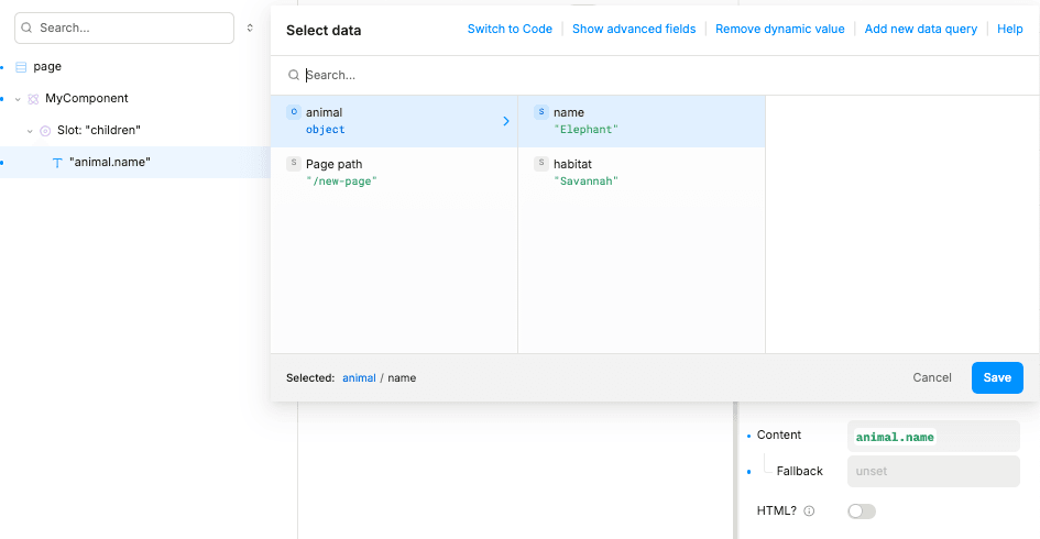
const animals = [{"name": "Elephant","habitat": "Savannah"},{"name": "Penguin","habitat": "Antarctica"},{"name": "Kangaroo","habitat": "Australian Outback"}];function MyComponent(props) {return (<div>{animals.map(item => (<p key={item.name}>{props.children(item)}</p>))}</div>)}PLASMIC.registerComponent(MyComponent, {name: 'MyComponent',props: {children: {type: 'slot',renderPropParams: ["animal"],}}});
In Studio, you can access the render prop arguments (specified by the renderPropParams field) inside the Data Picker modal, triggered from within the children slot content:
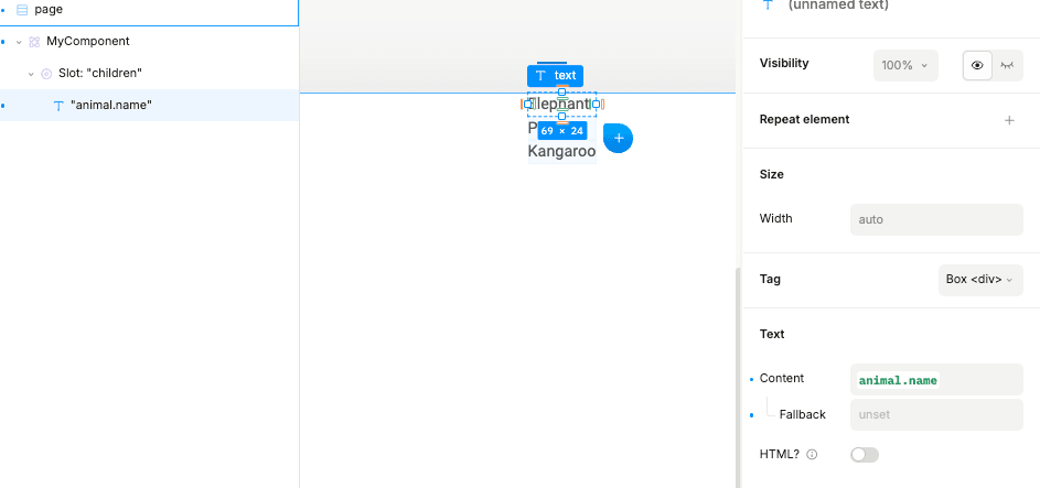
Here is the output on the canvas:
Prop control function
Where noted, instead of specifying a hard-coded value, you can instead specify a “prop control function” that dynamically returns the value to use based on current conditions.
A “prop control function” takes in two arguments:
- The component props for this component instance; this allows you to customize the value to use based on other props that are set for this instance.
- The component “context” set by your code component, which provides any other information that the component wants to pass in. Note that this “context” is not related to React Contexts.
Sometimes, your prop control function only needs access to the instance props to make its decisions.
For instance, you can conditionally set hidden on a prop control based on the values of other props:
function Slider({start, end, hasEnd,}: {hasEnd?: booleanstart?: number,end?: number,}) {return <div>...</div>;}registerComponent(ProductCard, {name: 'Slider',props: {hasEnd: 'boolean'start: 'number',end: {type: 'number',// `hidden` takes a prop control functionhidden: props => !props.hasEnd,},}});
Other times, it may also want to include other data, such as:
- Data that the component reads from a React Context.
- Data that the component fetches asynchronously.
- Data that the component computes.
For example, the options for your choice prop may depend on data passed down by some React Context. In that case, your code component can communicate this data to the control function. It does so by using a setControlContextData function that has been injected into your code component props:
function ProductCard({productId,setControlContextData}: {productId?: string;// When rendered in Studio artboard, a `setControlContextData` function will// be injected as a prop. This function can relay any data you want, so you// define whatever type it accepts.setControlContextData?: (ctxData: { allProductSlugs: string[] }) => void;}) {const { allProductSlugs } = React.useContext(StoreInfo);// Tell the prop control about what products are available// to choose from. We are just calling this for the side effect.setControlContextData?.({allProductSlugs});return <div>...</div>;}registerComponent(ProductCard, {name: 'ProductCard',props: {productId: {type: 'choice',options: (props, ctx) => {// Use the product slugs given to us from setControlContextData()return ctx.allProductSlugs;}}}});
Notice it’s possible that the prop controls render before the component instance - in which case, the context data will be null, and the controls will re-render once new context data is provided.
Exposing component state
Code components can also participate in the interactions and state framework by exposing some metadata and a few props.
Writable states
Suppose we are registering a TextInput code component, which is controlled by the value prop. We can tell Plasmic that it has a state called value, like this:
function TextInput({ value, onChange, className }) {return (<div className={className}><input value={value} onChange={(e) => onChange(e.target.value)} /></div>);}registerComponent(TextInput, {name: 'TextInput',props: {value: 'string',onChange: {type: 'eventHandler',argTypes: [{ name: 'value', type: 'string' }]}},states: {value: {// The state value is owned by the parent -- parent can control// the value of this statetype: 'writable',// The type of state valuevariableType: 'text',// The prop name that controls this statevalueProp: 'value',// The prop name for the event handler that is called whenever// this state changesonChangeProp: 'onChange'// The initial value of a writable state is sepecified as the// `defaultValue` for your valueProp}}});
This tells Plasmic how to control the state (by passing in the right value to the value prop), and how to listen to state changes (by using the onChange prop).
When the user uses a TextInput in Plasmic studio, they will see that each instance has a value state, and they’ll be able to read and update that state when rendering or in an interaction.
The variableType can be one of text, number, boolean, array, object.
Read-only states
Some states are controlled by the code component, but you still want to expose it to outside the component. For example, consider a DataTable code component that wants to expose the selectedRow:
function DataTable({data, onSelectedRowChange}) {...}registerComponent(DataTable, {name: "DataTable",props: {data: {type: "object"},onSelectedRowChange: {type: "eventHandler",argTypes: [{name: "row", type: "object"}]}},states: {selectedRow: {// This state cannot be controlled by the parent -- so can only be readtype: "readonly",variableType: "object",// Only need to specify an onChangeProp, not a valueProponChangeProp: "onSelectedRowChange"}}})
Initial state values
Because the parent component depends on the onChangeProp to communicate the state value, and because by convention, your code component likely does not call the onChangeProp upon initial rendering, and only upon user interaction, it is a good idea to also specify an initial state value, so that the parent component knows what the state value is, even before any onChange event handlers have been called.
registerComponent(Counter, {name: 'Counter',prop: {onCountChange: {type: 'eventHandler',argTypes: [{ name: 'count', type: 'number' }]}},states: {count: {type: 'readonly',onChangeProp: 'onCountChange',variableType: 'number',initVal: 0}}});
Note that for writable states, the initial value is specified as the defaultValue you registered for your valueProp.
You can also specify an initFunc instead, to derive the initial value from the component props:
PLASMIC.registerComponent(Counter, {name: "Counter",prop: {initCount: "number",onCountChange: ...},states: {count: {type: "readonly",onChangeProp: "onCountChange",variableType: "number",// Counter starts with $props.initCountinitFunc: $props => $props.initCount}}});
Transforming onChange args to state value
Often, the code component doesn’t call the onChange handler with the actual state value you intend to register; instead, you need to apply a transformation to obtain the state value from the handler arguments. For example, suppose your onChange prop for TextInput is called with a ChangeEvent instead of the new value of the input text:
PLASMIC.registerComponent(TextInput, {name: 'TextInput',props: {value: 'string',onChange: {type: 'eventHandler',argTypes: [{ name: 'event', type: 'object' }]}},states: {value: {type: 'writable',valueProp: 'value',variableType: 'text',onChangeProp: 'onChange',// Transform the argument to `onChange` to the state valueonChangeArgsToValue: (event) => event.target.value}}});
Component helper functions
Sometimes you need to specify functions that are used at run time to help your components work. You will need to put your functions somewhere that the generated code can find them. We call these “component helpers”. So far, the two examples of component helpers are initFunc and onChangeArgsToValue for working with component states.
The helpers you expose should be exported from some module at some path. For example,
export const TextInputHelpers = {states: {count: {initFunc: ($props) => $props.initValue,onChangeArgsToValue: (event) => event.target.value}}};
When you register the component, you will also need to specify where to import the helper functions from, as well as pass in an imported instance!
import { TextInputHelpers } from "~/components/text-input";registerComponent(TextInput, {...componentHelpers: {// imported instance, containing the helper functionshelpers: TextInputHelpers,// import pathimportPath: "~/components/text-input",importName: "TextInputHelpers"}});
The imported instance you pass in as helpers is necessary for Plasmic Studio to find and use those helper functions, while the importPath is necessary for generated code to find those same helper functions.
Element types
The defaultValue of a slot allows you to pass in an element tree, like this:
registerComponent({name: 'Button',props: {children: {type: 'slot',defaultValue: [{type: 'text',value: 'Click me!'}]}}});
An “element” is a JSON object that defines either an HTML tag or a component instance.
Common element fields
Some fields are common to all types of elements:
| Field | Required? | Description |
|---|---|---|
type | Yes | Defines the type of this element |
styles | No | A CSSProperties object with styles to be applied to the element. See styles |
Type-specific fields
Text elements
Renders an HTML tag with some text.
| Field | Required? | Description |
|---|---|---|
type | Yes | Must be "text" |
value | Yes | String value for this text element |
tag | No | The html tag to use for this text element; defaults to div |
attrs | No | An object of HTML attributes to set on this element |
You can actually just use a plain string instead of a JSON object as an element, to specify an unstyled span of text.
Container elements
Renders an HTML tag that contains other elements.
| Field | Required? | Description |
|---|---|---|
type | Yes | Can be "hbox" for a horizontal stack, "vbox" for a vertical stack, or "box" for a free container. |
children | No | An element JSON object, or an array of them, as the children elements of this container. |
tag | No | The html tag to use for this text element; defaults to div |
attrs | No | An object of HTML attributes to set on this element |
Image elements
Renders an image tag
| Field | Required? | Description |
|---|---|---|
type | Yes | Must be "img" |
src | Yes | URL of the image |
attrs | No | An object of HTML attributes to set on this element |
Input elements
Renders an input tag
| Field | Required? | Description |
|---|---|---|
type | Yes | Can be "input" for text input, "password" for password input, or "textarea" for multiline text input |
attrs | No | An object of HTML attributes to set on this element |
Component instances
Renders an instance of some component
| Field | Required? | Description |
|---|---|---|
type | Yes | Must be "component" |
name | Yes | Name of the component (for code components, should be its unique name it was registered with) |
props | No | An object with props to be provided to the component. The keys are the names of the props, and the values can be:
|
Default component instances
Your slot defaultValues can contain not only basic elements (like text/boxes/images) and instances of other code components, but also instances of the Plasmic “built-in” components like Buttons and Selects.
You can include these using code like the following:
{type: "default-component",kind: "button",props: { href: "#" }}
Note that a Plasmic project might not have any Button component, in which case, one will be created. Or it can have multiple, in which case the default one is used (projects let you designate a component as the default component for Button). You can specify the default component by right-clicking it in the components list, clicking on “Set as default component” in the sub-menu, and selecting the kind for this component.
| Field | Required? | Description |
|---|---|---|
type | Yes | Must be "default-component" |
kind | Yes | Must be one of the following option: "button", "text-input", "select", "switch" or "checkbox" |
props | No | An object with props to be provided to the component. The keys are the names of the props, and the values can be:
|
Template types
A “template” object defines a set of defaults to instantiate a component with. It accepts these fields:
| Field | Required? | Description |
|---|---|---|
styles | No | CSSProperties to use on the instance; see styles |
props | No | Props to use on the instance; same as for component instance elements |
previewImg | No | A URL string for an image preview for this template, to help the user identify the right template to use. |
Specifying templates is a great way to make your components easier to use by Studio users, especially if your component can be configured in many different ways. Studio users will be able to choose from this set of pre-defined templates when they insert this component.
Styles
defaultStyles and element.styles above take a CSSProperties object.
However, for now, Plasmic’s accepted CSS has some specific requirements:
- Use individual atomic properties, such as
fontFamily: 'Arial', fontSize: '18px', rather than shorthands likefont: '18px Arial'. columnGapandrowGapare the properties to use to set gaps in horizontal/vertical boxes (we emulate flex gaps in the modern CSS standard).- Some properties like
fontFamilyaccept only a single value (no font fallbacks). - When in doubt, try just opening up Plasmic Studio, which will sanitize/validate the style objects and inform you if there are issues.
How are names transformed in the Plasmic component API?
The names of components, elements, args (such as slot args), and variants are all camelCased. Components are always additionally capitalized, per React conventions.