Using NPM packages
You can use any npm package in your Plasmic project, whether you’re using the loader (Headless API) or codegen workflow. This lets you integrate third-party libraries, custom components, and specialized functionality into your visual development workflow.
Before continuing, make sure you have app hosting set up.
Use cases
Here are common scenarios where integrating npm packages might be valuable:
Charting and data visualization
Use libraries like Chart.js, Recharts, or D3 to create interactive charts and graphs with your data.
UI component libraries
Integrate existing component libraries like Material-UI, Ant Design, or Chakra UI to leverage pre-built components.
Form handling
Use form libraries like React Hook Form or Formik for complex form validation and state management.
Rich text editing
Add editors like CKEditor, TipTap, TinyMCE for content editing capabilities.
Utility libraries
Use date libraries (date-fns, moment.js), state management (Zustand, redux), or any other utility packages your project needs.
Example: Integrating Chart.js
Let’s walk through integrating Chart.js to create a custom chart component that can be used in Plasmic Studio.
Step 0: Setup your project
Before you can use npm packages, you need to set up your project
- Create a new Plasmic project.
- Create a Next.js app using create-plasmic-app.
- Configure the app host to connect the Studio to your codebase
Step 1: Install the packages
In your project directory, install Chart.js and its React wrapper:
npm install chart.js react-chartjs-2# or# yarn add chart.js react-chartjs-2
Step 2: Create a wrapper component
Create a new file for your chart component (e.g., components/Chart.tsx):
import React from 'react';import { Chart as ChartJS, CategoryScale, LinearScale, BarElement, Title, Tooltip, Legend } from 'chart.js';import { Bar } from 'react-chartjs-2';// Register Chart.js componentsChartJS.register(CategoryScale, LinearScale, BarElement, Title, Tooltip, Legend);export interface BarChartProps {title?: string;labels?: string[];data?: number[];barColor?: string;barBorderColor?: string;barBorderThickness?: number;className?: string;}export function BarChart({className,title,labels,data,barColor,barBorderColor,barBorderThickness}: BarChartProps) {const chartData = {labels,datasets: [{label: title,data,backgroundColor: barColor,borderColor: barBorderColor,borderWidth: barBorderThickness}]};const options = {responsive: true,maintainAspectRatio: true,plugins: {legend: {display: true,position: 'top' as const},title: {display: !!title,text: title}}};return (<div className={className}><Bar data={chartData} options={options} /></div>);}
Step 3: Register the component with Plasmic
In your app host file (e.g., pages/plasmic-host.tsx), register the component:
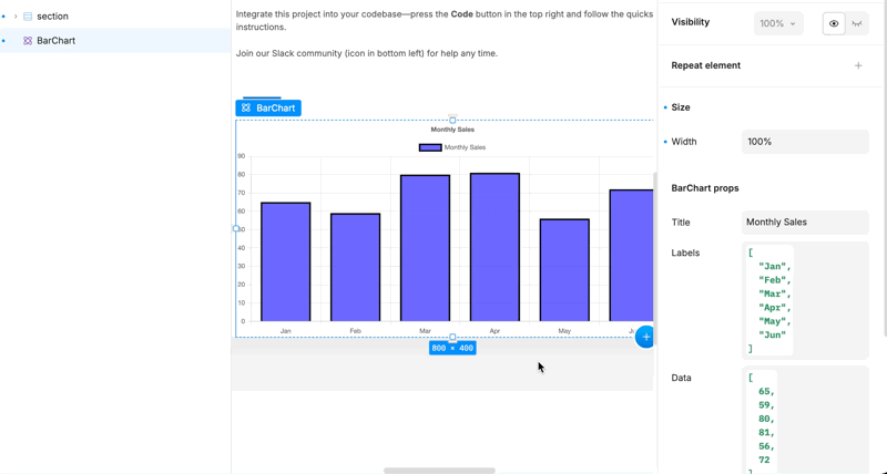
import { BarChart } from '../components/Chart';// ... other importsPLASMIC.registerComponent(BarChart, {name: 'BarChart',props: {title: {type: 'string',defaultValue: 'Monthly Sales'},labels: {type: 'array',defaultValue: ['Jan', 'Feb', 'Mar', 'Apr', 'May', 'Jun']},data: {type: 'array',defaultValue: [65, 59, 80, 81, 56, 72]},barColor: {type: 'color',defaultValue: 'rgba(75, 192, 192, 0.6)'},barBorderColor: {type: 'color',defaultValue: 'rgba(75, 192, 192, 1)'},barBorderThickness: {type: 'number',defaultValue: 1}}});
Step 4: Use the component in Plasmic Studio
Once registered, your BarChart component will appear in the component insertion menu in Plasmic Studio. You can:
- Drag the component onto your canvas
- Configure the props through the right-side panel
- Adjust the styling and layout of the root component visually
- Connect it to dynamic data through props or data sources
End result:
Next steps
- Learn more about registering code components
- Explore code component examples
- Read about passing dynamic data to components